Repository navigation
Expensify Card institution icon looks bland compared to others #5215

Description

Action Performed:
Break down in numbered steps
- Go to Settings > Payments in an account that has an Expensify Card and is importing other cards
- Look at the list of Payment methods
Expected Result:
The Expensify "institution" icon should look on par with other institutions like Chase and Bank of America. Given that we aren't showing an icon of a card for other banks, but rather the icon shown is the institution's logo, I would think we should use the Expensify logo since that is the institution issuing the card. Here's what it would look like if we did:
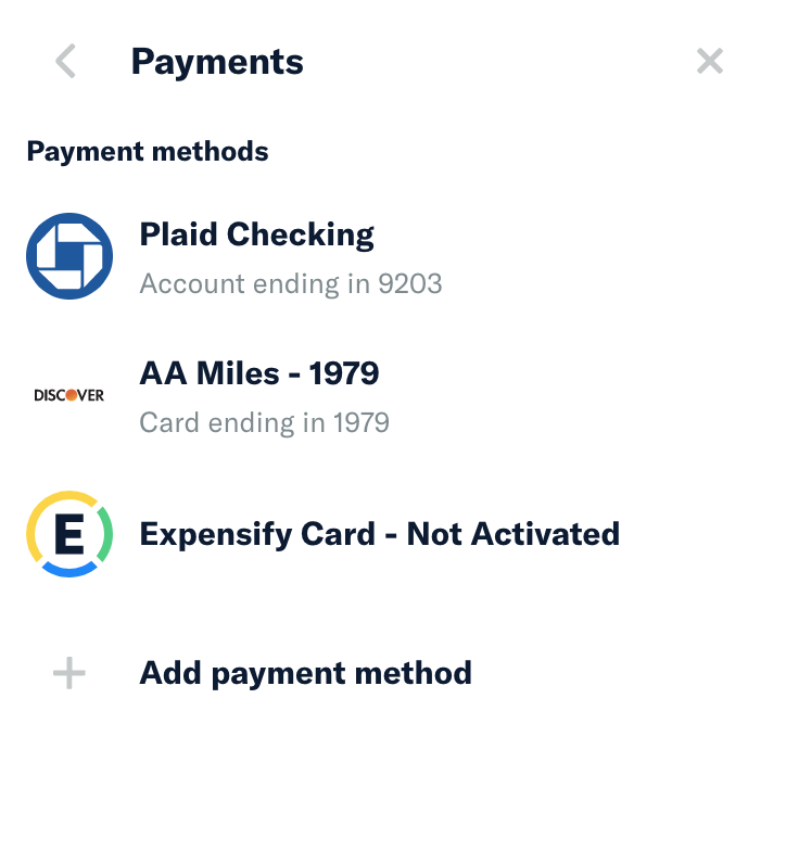
Actual Result:
The icon next to the Expensify Card looks bland and not like an actual institution.
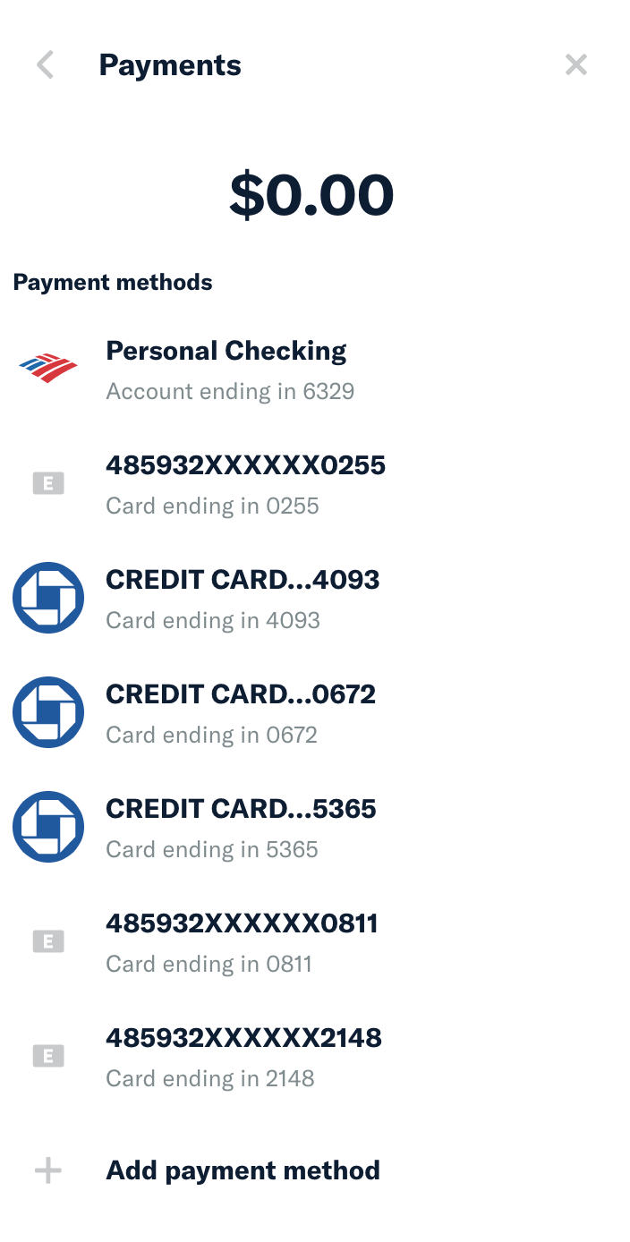
Platform:
Where is this issue occurring?
- Web
- iOS
- Android
- Desktop App
- Mobile Web
Version Number: v1.0.97-0
@Expensify/design curious what you think.
Activity
michelle-thompson commentedon Sep 13, 2021
Yeah, I agree that this would be a positive change!
puneetlath commentedon Sep 14, 2021
Cool, I'll do that then.
botify commentedon Sep 14, 2021
✋ This PR was not deployed to staging yet because QA is ongoing. It will be automatically deployed to staging after the next production release.
botify commentedon Sep 15, 2021
🚀 Deployed to staging by @iwiznia in version: 1.0.98-2 🚀