Skip to content

[No QA] Expand integrationIcons render-array into explicit JSX in ExportedIconCell - #100262

Merged
roryabraham merged 1 commit into
mainfrom
claude-explodeIntegrationIcons
Sep 7, 2026
Merged

roryabraham merged 1 commit into
mainfrom
claude-explodeIntegrationIcons

Conversation

@MelvinBot

@MelvinBot MelvinBot commented Sep 3, 2026 •

Copy link
Copy Markdown
Contributor

Explanation of Change

Follow-up to the review comment on #98031 (comment).

ExportedIconCell built an integrationIcons array of {name, src} objects gated on booleans, filtered the falsy entries with a type predicate, then rendered it with .map. The two icons immediately above it (Table and TablePencil) already rendered as plain conditional JSX, so the same component used two patterns for the same thing. The array form also invites future authors to add configuration props to the mapped element, and React Compiler memoizes the whole .map callback as one unit instead of memoizing each icon node.

This PR:

  • Removes the integrationIcons array and the .map, replacing them with ten conditional <Icon> blocks — one per integration, in the same order — matching the Table/TablePencil blocks above them. The QuickBooks block keeps its isExportedToQuickbooksOnline || isExportedToQuickbooksDesktop condition.
  • Hoists the shared StyleUtils.getAvatarBorderStyle(CONST.AVATAR_SIZE.XXX_SMALL, CONST.AVATAR_SHAPE.CIRCLE) call into a local integrationIconStyle const instead of repeating the call in every block.
  • Drops the key props, which are no longer needed now that the children are static.
  • Removes the IconAsset type import, which was only used by the filter's type predicate.

No behavior change: the same icons render, in the same order, at the same size, with the same circular border. The loop that computes the isExportedTo* booleans is untouched.

AI Tests

Run locally on this branch by MelvinBot:

  • npm run lint-changed — passed
  • npm run typecheck — passed
  • npm run react-compiler-compliance-check check src/components/Search/SearchList/ListItem/ExportedIconCell.tsx — passed (no compile failure and no memoization divergence under either the Babel or OXC compiler)
  • npm run spell-changed — passed (0 issues)
  • npm test -- tests/unit/TransactionGroupListItemTest.tsx tests/unit/Search/ExpenseFlatSearchViewTest.tsx tests/unit/Search/ExpenseReportSearchViewTest.tsx — passed (29 tests). No test file references ExportedIconCell directly; these cover the Search list rows that render it.

Not run: npm run prettier (this repo has no prettier npm script; formatting is enforced through ESLint, which passed). A browser smoke check of the Search list could not be completed — the web session in this run never rendered past a blank page, which is a test-infra failure unrelated to this diff.

Fixed Issues

$ #99462
PROPOSAL: #99462 (comment)

Tests

see @mananjadhav's review checklist

  • Verify that no errors appear in the JS console

Offline tests

None.

QA Steps

None.

  • Verify that no errors appear in the JS console

PR Author Checklist

  • I linked the correct issue in the ### Fixed Issues section above
  • I wrote clear testing steps that cover the changes made in this PR
    • I added steps for local testing in the Tests section
    • I added steps for the expected offline behavior in the Offline steps section
    • I added steps for Staging and/or Production testing in the QA steps section
    • I added steps to cover failure scenarios (i.e. verify an input displays the correct error message if the entered data is not correct)
    • I turned off my network connection and tested it while offline to ensure it matches the expected behavior (i.e. verify the default avatar icon is displayed if app is offline)
    • I tested this PR with a High Traffic account against the staging or production API to ensure there are no regressions (e.g. long loading states that impact usability).
  • I included screenshots or videos for tests on all platforms
  • I ran the tests on all platforms & verified they passed on:
    • Android: Native
    • Android: mWeb Chrome
    • iOS: Native
    • iOS: mWeb Safari
    • MacOS: Chrome / Safari
  • I verified there are no console errors (if there's a console error not related to the PR, report it or open an issue for it to be fixed)
  • I verified there are no new alerts related to the canBeMissing param for useOnyx
  • I followed proper code patterns (see Reviewing the code)
    • I verified that any callback methods that were added or modified are named for what the method does and never what callback they handle (i.e. toggleReport and not onIconClick)
    • I verified that comments were added to code that is not self explanatory
    • I verified that any new or modified comments were clear, correct English, and explained "why" the code was doing something instead of only explaining "what" the code was doing.
    • I verified any copy / text shown in the product is localized by adding it to src/languages/* files and using the translation method
      • If any non-english text was added/modified, I used JaimeGPT to get English > Spanish translation. I then posted it in #expensify-open-source and it was approved by an internal Expensify engineer. Link to Slack message:
    • I verified all numbers, amounts, dates and phone numbers shown in the product are using the localization methods
    • I verified any copy / text that was added to the app is grammatically correct in English. It adheres to proper capitalization guidelines (note: only the first word of header/labels should be capitalized), and is either coming verbatim from figma or has been approved by marketing (in order to get marketing approval, ask the Bug Zero team member to add the Waiting for copy label to the issue)
    • I verified proper file naming conventions were followed for any new files or renamed files. All non-platform specific files are named after what they export and are not named "index.js". All platform-specific files are named for the platform the code supports as outlined in the README.
    • I verified the JSDocs style guidelines (in STYLE.md) were followed
  • If a new code pattern is added I verified it was agreed to be used by multiple Expensify engineers
  • I followed the guidelines as stated in the Review Guidelines
  • I tested other components that can be impacted by my changes (i.e. if the PR modifies a shared library or component like Avatar, I verified the components using Avatar are working as expected)
  • I verified all code is DRY (the PR doesn't include any logic written more than once, with the exception of tests)
  • I verified any variables that can be defined as constants (ie. in CONST.ts or at the top of the file that uses the constant) are defined as such
  • I verified that if a function's arguments changed that all usages have also been updated correctly
  • If any new file was added I verified that:
    • The file has a description of what it does and/or why is needed at the top of the file if the code is not self explanatory
  • If a new CSS style is added I verified that:
    • A similar style doesn't already exist
    • The style can't be created with an existing StyleUtils function (i.e. StyleUtils.getBackgroundAndBorderStyle(theme.componentBG))
  • If new assets were added or existing ones were modified, I verified that:
    • The assets are optimized and compressed (for SVG files, run npm run compress-svg)
    • The assets load correctly across all supported platforms.
  • If the PR modifies code that runs when editing or sending messages, I tested and verified there is no unexpected behavior for all supported markdown - URLs, single line code, code blocks, quotes, headings, bold, strikethrough, and italic.
  • If the PR modifies a generic component, I tested and verified that those changes do not break usages of that component in the rest of the App (i.e. if a shared library or component like Avatar is modified, I verified that Avatar is working as expected in all cases)
  • If the PR modifies a component related to any of the existing Storybook stories, I tested and verified all stories for that component are still working as expected.
  • If the PR modifies a component or page that can be accessed by a direct deeplink, I verified that the code functions as expected when the deeplink is used - from a logged in and logged out account.
  • If the PR modifies the UI (e.g. new buttons, new UI components, changing the padding/spacing/sizing, moving components, etc) or modifies the form input styles:
    • I verified that all the inputs inside a form are aligned with each other.
    • I added Design label and/or tagged @Expensify/design so the design team can review the changes.
  • If a new page is added, I verified it's using the ScrollView component to make it scrollable when more elements are added to the page.
  • I added unit tests for any new feature or bug fix in this PR to help automatically prevent regressions in this user flow.
  • If the main branch was merged into this PR after a review, I tested again and verified the outcome was still expected according to the Test steps.

Screenshots/Videos

Android: Native
Android: mWeb Chrome
iOS: Native
iOS: mWeb Safari
MacOS: Chrome / Safari

…nCell

Co-authored-by: Manan <mananjadhav@users.noreply.github.com>
@MelvinBot
MelvinBot requested a review from a team September 3, 2026 06:25
@melvin-bot melvin-bot Bot added Melvin-Test-Android Melvin-Test-Web Triggers Melvin to run the testing steps of the PR on web labels Sep 3, 2026
@MelvinBot

Copy link
Copy Markdown
Contributor Author

🤖 Android test steps verification results: ⚠️ partial

This PR has no filled-in Tests section — the only documented assertion is "Verify that no errors appear in the JS console", so I ran that plus navigation through the screens that render the changed component. The app reached Home, the Search/Reports tab, and an open report with no crash and no JS exceptions in logcat. But the changed component could not be seen: ExportedIconCell is only rendered by ExpenseReportListItemRowWide, which is selected by isLargeScreenWidth — false on an Android phone — so it never mounts on this form factor. The test account also had zero expenses/reports, so there were no rows with exported-integration icons to inspect at all.

Report opened successfully

Step Status
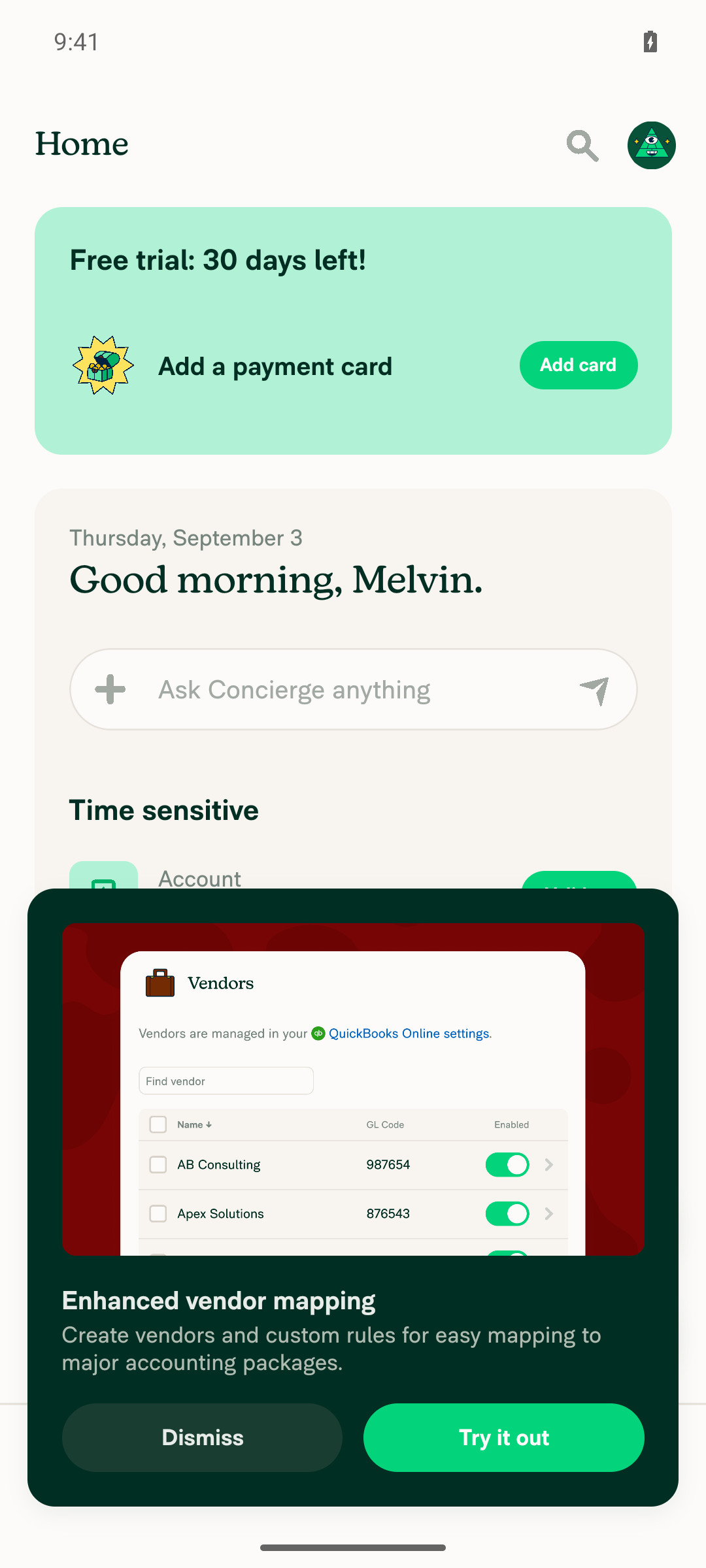
App reaches Home (Inbox) without a crash or error screenThe prestarted session landed on onboarding, not Home. Drove through Join → notification permission → intent selection → name entry, then landed on Home with Concierge chat, onboarding tasks, and bottom nav rendering normally.
Home/Inbox screen after onboarding
✅
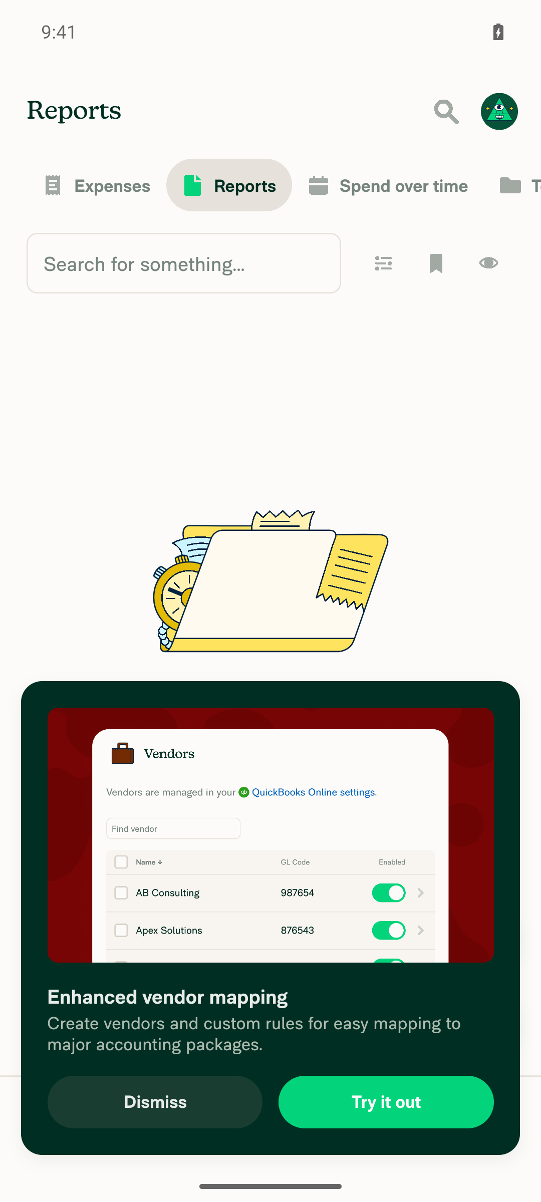
Reports/Search tab list renders normally, no blank screen or broken iconsThe Search hub rendered its tabs; Expenses and Reports both showed a proper empty state ("No expenses yet" / "No reports yet" with CTAs) — no blank screen, crash, or broken layout. This account has no expense or report data, so no list rows existed to inspect for icons.
Search/Reports tab empty state rendered normally
⚠️
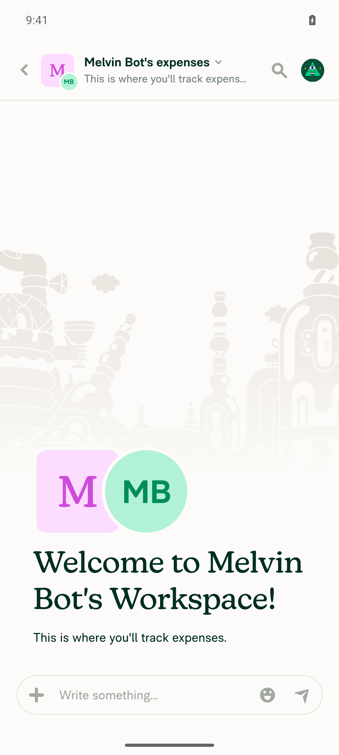
Open a report and confirm it renders normallyThe Search/Reports list was empty, so I opened the one available report-type chat from the LHN ("Melvin Bot's expenses" workspace expense chat). It opened cleanly — header, avatar, welcome message, and composer all rendered, no crash or error screen.
Report opened successfully
✅
Documented step: verify no errors appear in the JS consoleCaptured logcat across Home → Search/Reports → report open. No FATAL EXCEPTION, ExceptionsManager, RedBox, Invariant Violation, TypeError, or ReferenceError matches. Background Search API polling logged repeated "Oops... something went wrong" payloads (responseJsonCode 0) for prefetched search hashes — a network/backend response failure, not a JS exception, and no error banner appeared in the UI.
Search/Reports tab empty state rendered normally
✅

What this run does not prove: the icons this PR touches were never rendered on screen, for two independent reasons — the narrow phone layout picks ExpenseReportListItemRowNarrow, and the account had no exported expenses. Android native is not a form factor where this change is observable. To actually verify the refactor visually, test on a wide layout (desktop/web at large width, or a tablet) with an account that has expenses exported to an integration.


view run

@MelvinBot

Copy link
Copy Markdown
Contributor Author

No code fix is needed — every automated check on this PR passes. The single failing check is a process gate, not a build or test failure.

Check independent approval fails at its Verify peer review step (job log). That check requires an approving review from someone other than the PR author. This PR has no approval yet, so the gate reports failure by design. It will pass once a reviewer approves.

Full check status

Passing: ESLint check, typecheck, Bun tests, test (jobs 1-8), Storybook tests, spellcheck, Oxfmt check, React Compiler Compliance, Check for unused styles, Compare knip issues against main, verifySignedCommits, CLA, all four Android/iOS build jobs, and the perf test jobs.

Failing: Check independent approval only.

I did not push a commit, since there is no code defect to correct.


view run

@MelvinBot

Copy link
Copy Markdown
Contributor Author

🤖 Web test steps verification results: ⚠️ partial

Tested on dev NewDot at 1440x900 (wide layout, so the Wide row variants that mount ExportedIconCell are in play). The app reached Home, and the Search → Expenses list, an expense detail view, and the Search → Reports empty state all rendered normally with no crashes. The exported-integration icons themselves were not observable: this account has no accounting integration connected, so no row carries an export action for the component to render an icon from. The Reports tab also could not be populated — creating a report hits a paid-plan upgrade paywall.

Search Expenses list, console-check evidence baseline

Step Status
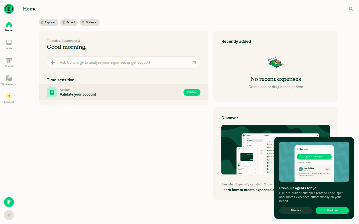
App reaches Home (Inbox) without a crash or error screenHome heading, quick-action pills (Expense/Report/Distance), and nav tabs all rendered; no error boundary or blank screen.
Home/Inbox screen
✅
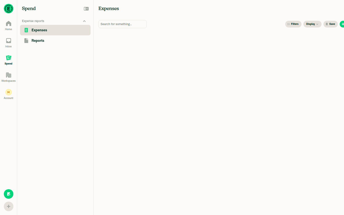
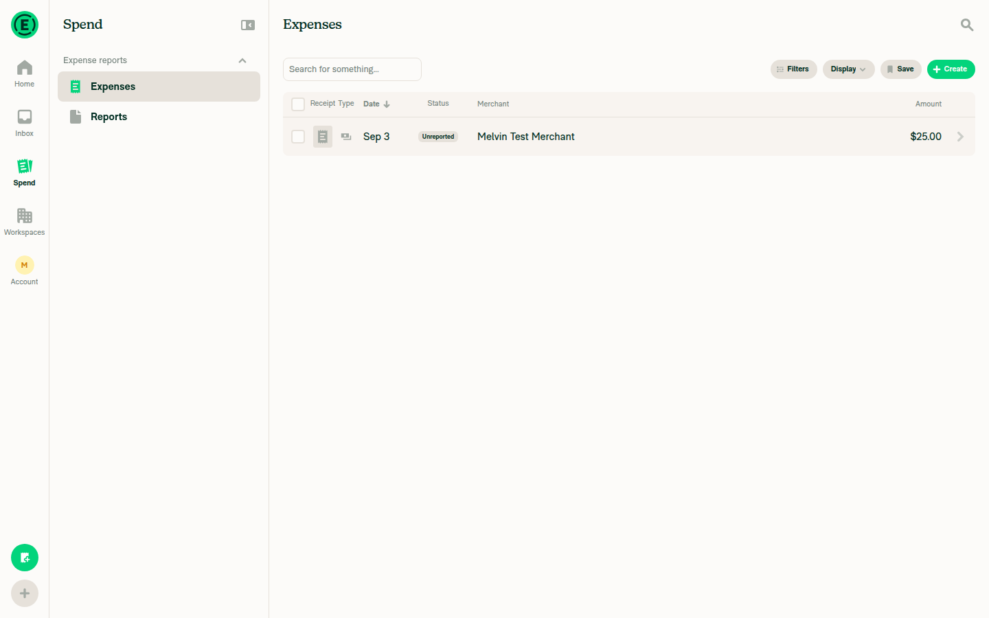
Search → Expenses renders normally at wide width, no broken or misaligned iconsAccount started at "No expenses yet" (empty state rendered correctly). Created one manual expense ($25.00, Melvin Test Merchant); the list then rendered a single correctly-aligned row — receipt-type icon, date, "Unreported" status pill, merchant, amount — with column headers intact. No exported-integration icon appeared, expected on an account with no accounting integration connected.
Search Expenses list with one expense row, wide layout
✅
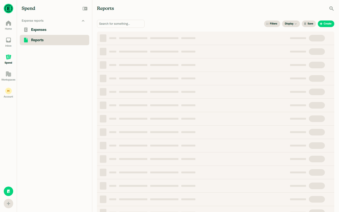
Search → Reports renders normally at wide widthReports rendered its empty state cleanly ("No reports yet", Create report / Take a test drive buttons, no layout breakage). Creating a report surfaced an "Upgrade to Collect plan" paywall, so a populated Reports row — and its icon cell — could not be exercised in a verify-only run.
Search Reports empty state, wide layout
⚠️
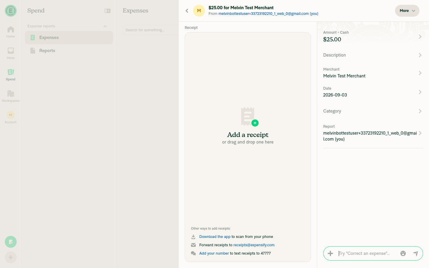
Open a report/expense from the list and confirm it renders normallyClicking the expense row opened the detail view with Amount, Merchant, Date, Category, and Report fields populated, plus the receipt panel and composer. No errors.
Expense detail page
✅
Documented step: verify no errors appear in the JS consoleThe web driver has no console/devtools access, so the console could not be read directly. Indirect check: a network dump across the full flow (Home load, Search/Expenses, expense creation, Search/Reports, opening the expense) showed every request — Search, OpenSearchPage, OpenReport, Log, Ping, PusherPing, AuthenticatePusher — returning 200, with no failed or 5xx calls and no error screens or crash boundaries at any point.
Search Expenses list, console-check evidence baseline
⚠️

What this run does not prove: no row rendered an actual exported-integration icon, so the icons this PR touches were never drawn on screen. ExportedIconCell only emits an icon when a row's report actions include an export-to-integration action, and this account has no integration connected. To fully verify the refactor, test with an account that has expenses exported to NetSuite/Xero/QBO/etc. and confirm the same icons appear in the same order as on main.


view run

@mananjadhav mananjadhav left a comment

Copy link
Copy Markdown
Collaborator

Choose a reason for hiding this comment

The reason will be displayed to describe this comment to others. Learn more.

The code changes are fine.

@mananjadhav

Copy link
Copy Markdown
Collaborator

Reviewer Checklist

  • I have verified the author checklist is complete (all boxes are checked off).
  • I verified the correct issue is linked in the ### Fixed Issues section above
  • I verified testing steps are clear and they cover the changes made in this PR
    • I verified the steps for local testing are in the Tests section
    • I verified the steps for Staging and/or Production testing are in the QA steps section
    • I verified the steps cover any possible failure scenarios (i.e. verify an input displays the correct error message if the entered data is not correct)
    • I turned off my network connection and tested it while offline to ensure it matches the expected behavior (i.e. verify the default avatar icon is displayed if app is offline)
  • I checked that screenshots or videos are included for tests on all platforms
  • I included screenshots or videos for tests on all platforms
  • I verified that the composer does not automatically focus or open the keyboard on mobile unless explicitly intended. This includes checking that returning the app from the background does not unexpectedly open the keyboard.
  • I verified tests pass on all platforms & I tested again on:
    • Android: HybridApp
    • Android: mWeb Chrome
    • iOS: HybridApp
    • iOS: mWeb Safari
    • MacOS: Chrome / Safari
  • If there are any errors in the console that are unrelated to this PR, I either fixed them (preferred) or linked to where I reported them in Slack
  • I verified proper code patterns were followed (see Reviewing the code)
    • I verified that comments were added to code that is not self explanatory
    • I verified that any new or modified comments were clear, correct English, and explained "why" the code was doing something instead of only explaining "what" the code was doing.
    • I verified any copy / text that was added to the app is grammatically correct in English. It adheres to proper capitalization guidelines (note: only the first word of header/labels should be capitalized), and is either coming verbatim from figma or has been approved by marketing (in order to get marketing approval, ask the Bug Zero team member to add the Waiting for copy label to the issue)
  • If a new code pattern is added I verified it was agreed to be used by multiple Expensify engineers
  • I verified that this PR follows the guidelines as stated in the Review Guidelines
  • I verified other components that can be impacted by these changes have been tested, and I retested again (i.e. if the PR modifies a shared library or component like Avatar, I verified the components using Avatar have been tested & I retested again)
  • If a new component is created I verified that:
    • A similar component doesn't exist in the codebase
    • All props are defined accurately
    • The component has a clear name that is non-ambiguous and the purpose of the component can be inferred from the name alone
    • The only data being stored in the state is data necessary for rendering and nothing else
    • The component has the minimum amount of code necessary for its purpose, and it is broken down into smaller components in order to separate concerns and functions
  • If a new CSS style is added I verified that:
    • A similar style doesn't already exist
    • The style can't be created with an existing StyleUtils function (i.e. StyleUtils.getBackgroundAndBorderStyle(theme.componentBG)
  • If the PR modifies code that runs when editing or sending messages, I tested and verified there is no unexpected behavior for all supported markdown - URLs, single line code, code blocks, quotes, headings, bold, strikethrough, and italic.
  • If the PR modifies a generic component, I tested and verified that those changes do not break usages of that component in the rest of the App (i.e. if a shared library or component like Avatar is modified, I verified that Avatar is working as expected in all cases)
  • If the PR modifies a component related to any of the existing Storybook stories, I tested and verified all stories for that component are still working as expected.
  • If the PR modifies a component or page that can be accessed by a direct deeplink, I verified that the code functions as expected when the deeplink is used - from a logged in and logged out account.
  • If the PR modifies the UI (e.g. new buttons, new UI components, changing the padding/spacing/sizing, moving components, etc) or modifies the form input styles:
    • I verified that all the inputs inside a form are aligned with each other.
    • I added Design label and/or tagged @Expensify/design so the design team can review the changes.
  • For any bug fix or new feature in this PR, I verified that sufficient unit tests are included to prevent regressions in this flow.
  • If the main branch was merged into this PR after a review, I tested again and verified the outcome was still expected according to the Test steps.
  • I have checked off every checkbox in the PR reviewer checklist, including those that don't apply to this PR.

Screenshots/Videos

Android: HybridApp

NA. Only for desktop.

Android: mWeb Chrome

NA. Only for desktop.

iOS: HybridApp

NA. Only for desktop.

iOS: mWeb Safari

NA. Only for desktop.

MacOS: Chrome / Safari Screenshot 2026-09-06 at 11 56 07 PM Screenshot 2026-09-06 at 11 56 44 PM

@mananjadhav mananjadhav left a comment

Copy link
Copy Markdown
Collaborator

Choose a reason for hiding this comment

The reason will be displayed to describe this comment to others. Learn more.

I don't think we'll need QA on this one.

@melvin-bot
melvin-bot Bot requested a review from roryabraham September 6, 2026 18:35
@roryabraham roryabraham changed the title Expand integrationIcons render-array into explicit JSX in ExportedIconCell [No QA] Expand integrationIcons render-array into explicit JSX in ExportedIconCell Sep 7, 2026
@roryabraham
roryabraham marked this pull request as ready for review September 7, 2026 18:26
@roryabraham
roryabraham requested a review from a team as a code owner September 7, 2026 18:26
@melvin-bot

melvin-bot Bot commented Sep 7, 2026

Copy link
Copy Markdown

@mananjadhav Please copy/paste the Reviewer Checklist from here into a new comment on this PR and complete it. If you have the K2 extension, you can simply click: [this button]

@melvin-bot
melvin-bot Bot removed request for a team September 7, 2026 18:26

@mananjadhav mananjadhav left a comment

Copy link
Copy Markdown
Collaborator

Choose a reason for hiding this comment

The reason will be displayed to describe this comment to others. Learn more.

Approving again. Checklist here.

/>
)}
{integrationIcons.map(({name, src}) => (
{isExportedToNetsuite && (

Copy link
Copy Markdown
Contributor

Choose a reason for hiding this comment

The reason will be displayed to describe this comment to others. Learn more.

❌ CONSISTENCY-3 (docs)

This change replaces a single, data-driven icon list with ten near-identical <Icon> JSX blocks that differ only in the guarding boolean and the src value. Every block repeats the same size={CONST.ICON_SIZE.SMALL} and additionalStyles={[integrationIconStyle]} structure, so adding, removing, or restyling an integration icon now requires editing every copy, raising maintenance overhead and bug risk (DRY violation).

Consolidate the repetition by iterating over a small config that maps a condition to its icon source, keeping a single <Icon> definition:

const integrationIcons = [
    {show: isExportedToNetsuite, name: 'NetSuiteSquare', src: icons.NetSuiteSquare},
    {show: isExportedToXero, name: 'XeroSquare', src: icons.XeroSquare},
    {show: isExportedToIntacct, name: 'IntacctSquare', src: icons.IntacctSquare},
    {show: isExportedToQuickbooksOnline || isExportedToQuickbooksDesktop, name: 'QBOSquare', src: icons.QBOSquare},
    {show: isExportedToIntuitEnterpriseSuite, name: 'IntuitSquare', src: icons.IntuitSquare},
    {show: isExportedToCertinia, name: 'CertiniaSquare', src: icons.CertiniaSquare},
    {show: isExportedToRillet, name: 'RilletSquare', src: icons.RilletSquare},
    {show: isExportedToDualEntry, name: 'DualEntrySquare', src: icons.DualEntrySquare},
    {show: isExportedToBillCom, name: 'BillComSquare', src: icons.BillComSquare},
    {show: isExportedToZenefits, name: 'ZenefitsSquare', src: icons.ZenefitsSquare},
];

// ...
{integrationIcons
    .filter(({show}) => show)
    .map(({name, src}) => (
        <Icon
            key={name}
            src={src}
            size={CONST.ICON_SIZE.SMALL}
            additionalStyles={[integrationIconStyle]}
        />
    ))}

This keeps a single source of truth for the <Icon> markup while still avoiding the removed inline object churn.


Reviewed at: 5398ced | Please rate this suggestion with 👍 or 👎 to help us improve! Reactions are used to monitor reviewer efficiency.

Copy link
Copy Markdown
Contributor

Choose a reason for hiding this comment

The reason will be displayed to describe this comment to others. Learn more.

@roryabraham
roryabraham merged commit a6f8c39 into main Sep 7, 2026
51 of 58 checks passed
@roryabraham
roryabraham deleted the claude-explodeIntegrationIcons branch September 7, 2026 18:30
@OSBotify

OSBotify commented Sep 7, 2026

Copy link
Copy Markdown
Contributor

✋ This PR was not deployed to staging yet because QA is ongoing. It will be automatically deployed to staging after the next production release.

@github-actions

github-actions Bot commented Sep 7, 2026

Copy link
Copy Markdown
Contributor

🚧 roryabraham has triggered a test Expensify/App build. You can view the workflow run here.

@OSBotify OSBotify mentioned this pull request Sep 8, 2026
69 tasks done
@OSBotify

OSBotify commented Sep 8, 2026

Copy link
Copy Markdown
Contributor

🚀 Deployed to staging by https://github.com/roryabraham in version: 9.4.74-0 🚀

platform result
🕸 web 🕸 success ✅
🤖 android 🤖 success ✅
🍎 iOS 🍎 success ✅

@MelvinBot

MelvinBot commented Sep 8, 2026 •

Copy link
Copy Markdown
Contributor Author

🤖 No help site changes are required for this PR, so I did not create a draft docs PR.

This PR is a pure render refactor of one component. It replaces the integrationIcons array + .map in src/components/Search/SearchList/ListItem/ExportedIconCell.tsx with ten explicit conditional <Icon> blocks, hoists the shared border style into a local const, and drops the now-unneeded key props and IconAsset import.

Nothing user-facing changes:

  • The same integration icons render, in the same order, at the same size, with the same circular border.
  • The isExportedTo* conditions are untouched — no integration was added, removed, or renamed.
  • No UI labels, tab names, settings, buttons, or flows changed.

I checked docs/articles for anything this could affect. The integration articles there (QuickBooks Online, Xero, NetSuite, Sage Intacct, Certinia, Rillet, and the export-error pages) document how to connect and export to each integration. None of them document the exported-icon column in the Search list, and none of the behavior they describe is changed by this diff.

Since no docs PR was needed, there is no linked help site PR to review. If you'd like one anyway — for example to document the exported-integration indicator itself — reply with what you want covered and I'll draft it.


view run · view recording

@OSBotify

OSBotify commented Sep 9, 2026

Copy link
Copy Markdown
Contributor

🚀 Deployed to production by https://github.com/mountiny in version: 9.4.74-2 🚀

platform result
🕸 web 🕸 success ✅
🤖 android 🤖 success ✅
🍎 iOS 🍎 success ✅

Sign up for free to join this conversation on GitHub. Already have an account? Sign in to comment

Labels

Melvin-Test-Android Melvin-Test-Web Triggers Melvin to run the testing steps of the PR on web

Projects

None yet

Development

Successfully merging this pull request may close these issues.

4 participants