Repository navigation
Use the default circle shape for the onboarding accounting radio buttons - #102477
Conversation


Co-authored-by: Marco Chávez <marcochavezf@users.noreply.github.com>

 melvin-bot
Bot
added
Melvin-Test-Android
Melvin-Test-Web

|
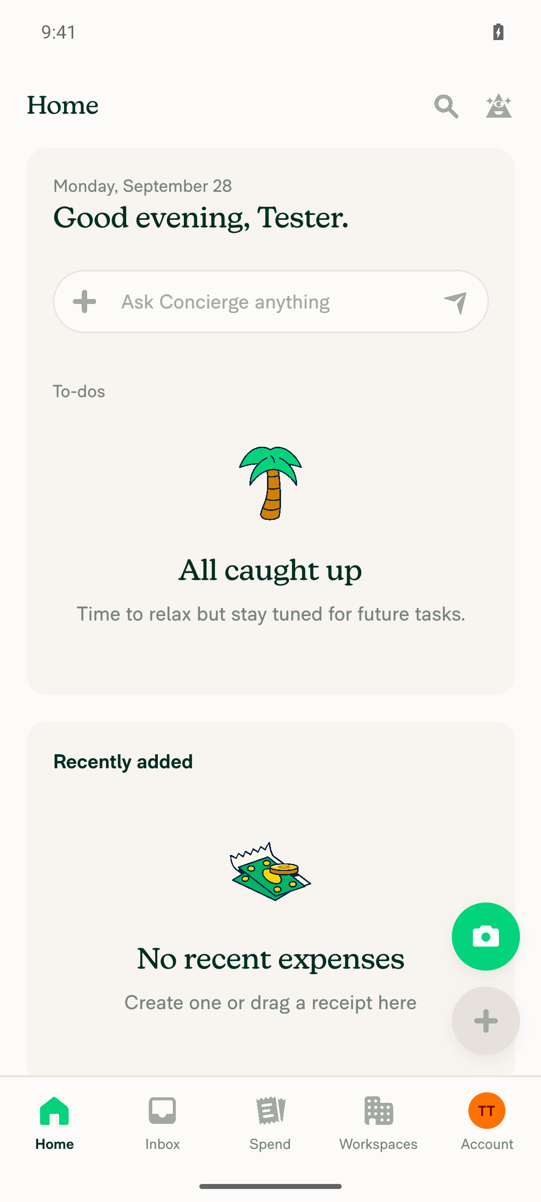
🤖 Android test steps verification results: ❌ fail I couldn't run the test steps on Android. The test account had already finished onboarding, so the app opened on Home. The "Do you use any accounting software?" step only appears for accounts that haven't finished onboarding. No step was checked, so this result says nothing about the fix itself.
To test this on Android, rerun with a fresh account that hasn't finished onboarding. The PR's Tests section is still empty, so I used the steps to reproduce from the linked issue. |
|
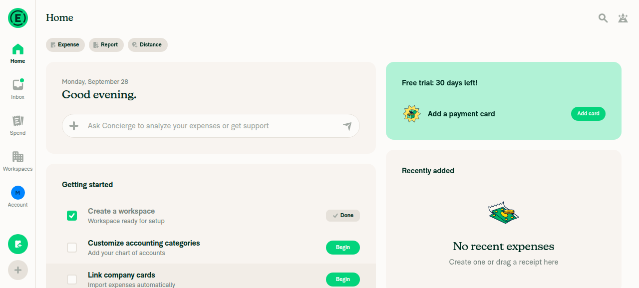
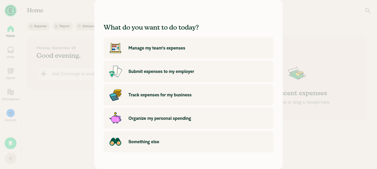
🤖 Web test steps verification results: The onboarding purpose step passed, but the test never reached the "Do you use any accounting software?" step. On the "What features are you interested in?" step, the tester clicked the Accounting option, which is already selected by default, and turned it off. Onboarding then finished without showing the accounting step. This was a test-run mistake, not an App bug, so the round radio indicators are still unverified.
To finish this check, rerun it with a fresh account and leave the Accounting option selected. The PR's Tests section is still empty, so I used the steps to reproduce from the linked issue. |


|
@mkhutornyi Please copy/paste the Reviewer Checklist from here into a new comment on this PR and complete it. If you have the K2 extension, you can simply click: [this button] |

|
🚧 marcochavezf has triggered a test Expensify/App build. You can view the workflow run here. |

|
I don't think this PR is needed. 
cc: @Expensify/design |

|
Isn't this mostly a question about whether you can select multiple or not? If multiple, then use square checkbox, if single option, then use round radio. I believe you can only select one though so I think this is fine!? @dylanexpensify to confirm. |
This comment has been minimized.
This comment has been minimized.
|
We can only select one. |
I think it was just a mock bug that got carried over and we didn't notice. If you can only select one then using the radio buttons is correct 👍 |
Reviewer Checklist
Screenshots/VideosAndroid: HybridAppAndroid: mWeb ChromeiOS: HybridAppiOS: mWeb SafariMacOS: Chrome / SafariScreen.Recording.2026-09-29.at.4.58.59.AM.mov |


Ah yes, only one to select! |


 trjExpensify
left a comment
trjExpensify
left a comment
There was a problem hiding this comment.
LGTM. CC: @Expensify/design

|
Looking good to me too 👍 |
|
Same. Send it! |


|
🚧 roryabraham has triggered a test Expensify/App build. You can view the workflow run here. |
|
🧪🧪 Use the links below to test this adhoc build on Android, iOS, and Web. Happy testing! 🧪🧪
|


|
🚀 Deployed to staging by https://github.com/roryabraham in version: 9.5.0-0 🚀
|
|
No help site update is needed. This PR only changes the onboarding accounting selector from a square shape to a round radio button, and no help article describes that shape. |

|
@mkhutornyi any QA steps to be rested? |
Use the test steps in the linked issue
|
|
🚀 Deployed to production by https://github.com/Julesssss in version: 9.5.0-5 🚀
Bundle Size Analysis (Sentry): |


Explanation of Change
Update the accounting software options and switch to a tile layout passed
containerBorderRadius={variables.componentBorderRadiusSmall}to theRadioButtonon each accounting tile.SelectionButtonshows radio vs. checkbox only through the border radius, so the single-select radios looked like square checkboxes. That breaks the single-select vs. multi-select convention from Consistent checkboxes and radio buttons UI.This PR removes the override so the tiles use the default circular radio shape. Behavior and accessibility role (
radio) are unchanged.Automated checks run by MelvinBot:
npm run lint-changed,npm run typecheck, React Compiler compliance check on the changed file, andtests/ui/OnboardingAccountingAndInterestedFeatures.tsx(10/10 passed). A web browser check on the dev build confirmed round radio indicators and single selection:Fixed Issues
$ #102469
PROPOSAL: #102469 (comment)
Tests
// TODO: The human co-author must fill out the tests you ran before marking this PR as "ready for review"
// Please describe what tests you performed that validates your changed worked.
Offline tests
QA Steps
// TODO: The human co-author must fill out the QA tests you ran before marking this PR as "ready for review".
// Please describe what QA needs to do to validate your changes and what areas do they need to test for regressions.
PR Author Checklist
### Fixed Issuessection aboveTestssectionOffline stepssectionQA stepssectionAvatar, I verified the components usingAvatarare working as expected)StyleUtils.getBackgroundAndBorderStyle(theme.componentBG))npm run compress-svg)Avataris modified, I verified thatAvataris working as expected in all cases)Designlabel and/or tagged@Expensify/designso the design team can review the changes.mainbranch was merged into this PR after a review, I tested again and verified the outcome was still expected according to theTeststeps.Screenshots/Videos
Android: Native
Android: mWeb Chrome
iOS: Native
iOS: mWeb Safari
MacOS: Chrome / Safari