
Incomplete — Currently in Progress Last update: 20 Apr 2017
CSS Wizardry is quite a good resource! For starters:
- Use
Block__Element--Modifier: BEM Syntax - Include namespace prefixes to improve identification: About Namespaces
- Eventually the structure should be somewhat like this: ITCSS
Important to know and avoid:
Up for discussion:
- Limiting BEM to a single element level i.e. disallowing
block__element__element - Use of
--modifierstate suffixes vs.is-/has-conditional prefixes- I think
--modifiertypes should be used when adding classes to elements in the codebase, whileis-/has-types should only be applied via JS appendation
- I think
- Usage of CSS3 wildcards & attribute selectors, especially for important UI features
Broadly speaking, there are 2 categories of namespaces.
-
Preset classes have pre-determined functions and should not have any additional properties attributed and/or bound to them.
-
Globally-applicable by default:
o-: Objects. Used for globally applicable elements and complex blocks. Should be purely structural with no aesthetic style properties (normalising properties are exception) Examples includeo-gridbox__listando-swipe__listic-: Icons. Used to apply symbols (as a pseudo-element). All symbols should be applied from the predefined list ofic-prefixed classes @.u-: Utility. Single-purpose class that applies important but isolated propert(ies) to an elementhk-: Hack. Write only into../override/shame.scss. Used for single-purpose & isolated tricks, cheats, magic numbers, etc. Should be returned to and removed once a proper solution is found
-
Component-specific by default:
js-: Javscript-binding. Used only by scripts. Should be made globally-applicable if requested for CMS content usageis-,has-: JS-appended conditions. Used to modify the style of an element / element + siblings / elements > childrens-: Scope. Used only for sections where all children are naked elements with no selector names, e.g. CMS FAQ block, blog post content
-
-
Styling classes are created as UI components are being designed. They contain all kinds of properties that lead to the final look of the element / complex block.
c-: Components. Used to define a specific piece of UI. Should be named clearly so its function and reach is understood. Use additional modifier classes to style variants whenever reasonable to do so (i.e. when structural contents don't change, e.g. USP bar)
-
NEVER use
id's and!important's, ever. We will remove all existingid's and!important's out over time -
Always use
border: 0;to define no-border. -
By default, use soft commenting for CSS, i.e.
// This is a soft comment that will not appear in CSS output

//------------------------------------------------------------
// This is a multi-line soft comment that keeps within a max
// line-length of 60 characters so that the comment message
// can be read easily without excess horizontal scrolling
//------------------------------------------------------------
Only use
/* COMMENT */if it is necessary to show comemnts in the output -
In almost all cases, CSS should be set in this format:
.icon {
  display: inline-block;
  padding: 10px;
  background-color: #fafafa;
}
In cases where values are to be matched or compared, it is ok to format lines like this:
  width:  16px;
  height: 16px;
Or even like this:
.icon--home { background-position: 0 0 ; } .icon--nav { background-position: -5px 0 ; } .icon--collection { background-position: 0 -5px; } .icon--product { background-position: -5px -5px; } -
Please use variables and mixins wherever possible, especially for specified-colour variables and vendor-prefix assisting mixins
- A continuously updated symbols font is being maintained in LLQ at:
../assets/fonts - All currently available symbols for use can be looked up at: [/symbols-reference]
-
Symbols are applied as CSS pseudo-element content
-
.ic-bef(applied to :before) or.ic-aft(applied to :after) declares the Symbols` font-family property -
Symbol styling can be applied quickly through the
font_iconseries of mixins available from../abstracts/hv-mixins.scss -
Where applicable, symbol variants can be shown by adding modifier classes:
Weight Modifier: Bold Icon .ic-bold Solid Icon .ic-solid Style Modifier: Arrows .ic-dir-up, .ic-dir-down, .ic-dir-left, .ic-dir-left2, .ic-dir-right, .ic-dir-right2 Shipping .ic-ship-free, .ic-ship-fast, .ic-ship-fsfr Magnify, Stretch .ic-zoom-out, .ic-zoom-in Star .ic-star-half, .ic-star-full
-
The CSS
<style> .yourWrapper { font-size: 0; // removes excess spacing from inline-blocks } span[class^="yourClass"] { display: inline-block; font-size: 24px; vertical-align: middle; } span[class^="yourClass"]:before, span[class^="yourClass"]:after { display: inline-block; height: 44px; width: 44px; font-size: 44px; line-height: 1; margin-right: 5px; vertical-align: middle; } </style> -
The HTML
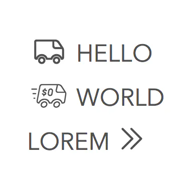
<div class="yourWrapper"> <span class="yourClass1 ic-bef ic-misc-ship ic-bold">HELLO</span> <br> <span class="yourClass2 ic-bef ic-misc-ship ic-ship-fsfr">WORLD</span> <br> <span class="yourClass3 ic-aft ic-site-arrow ic-dir-right2">LOREM</span> </div> -
The Result:
- Gradually switch the @import of
mixins&variables→hv-mixins&hv-variablesin all SCSS partials. Only copy across required variables & mixins to the new files and sort them accordingly - Following from above, only
hv-mixins&hv-variableswill receive updates; the 2 olders ones are deprecated assets
- For most cases moving forward,
font-sizecan be simply defined via the mixintext_size. Font-sizes are graded according to the modular scale described by Bourbon. We make use of 2 scales:- For h1 — h6:
$minor-third; example for <h1>:@include text_size(4, $minor-third); - For regular body content:
$minor-second; example for <p>:@include text_size(0);(no need to specify scale used because$minor-secondis the default value)
- For h1 — h6:
text_sizegenerates both mobile & non-mobile font-sizes. To declare custom font-sizes for individual media breakpoints, use the originalmodular-scalefunction instead:- Default body font-size on mobile:
modular-scale(0, $sizeFont_em); - Default body font-size on non-mobile:
modular-scale(0, $sizeFont);
- Default body font-size on mobile:
-
Form boxes and buttons are defined in 5 sizes:
xs/s/m/l/xl -
There are 3 preset colours and 1 outlining modifier style:
primary/secondary/grey/ghost
- Box-shadows should be set via the mixin
z-shadow, which produces acceptable output between the values 1 - 9
- Marketing & Merchandising will upload
.pngfiles wherever possible - The current set of Imgix parameters to be applied by default for LLQ are:
auto=format: Lets Imgix serve WebP or otherwise fall back to other supported optimised formatslossless=0: Allows lossy images whenever they are optimised forcs=srgb: Sets colourspace as Marketing & Merchandising intended
- Usage of
srcsetand the Imgixcropattributescrop=entropy/crop=edges
- Useful introductory article here
- Currently, case-sensitive forms are switched on by default via
font-feature-settings: "case" 1;so that brackets and hyhens/dashes are rendered correctly - We can consider applying
"tnum" 1for cart / order page tabulated figures