
Write desktop apps in Svelte and render them straight into a native, GPU-accelerated window.
gpuix-svelte is a Svelte custom renderer for GPUI, the UI framework behind
the Zed editor. It talks to GPUI through @gpuix/native.
Warning
Experimental. gpuix-svelte is built on Svelte's unreleased custom renderer API, so every release ships the exact Svelte build it was tested against (see About the Svelte version). Expect breaking changes between minor versions.
npm create gpuix-svelte@latest my-app
cd my-app
npm install
npm start
A counter opens in its own window. Edit App.svelte, save, and the window hot-reloads.
You need Node.js 24 or later or Bun 1.4 or later, on macOS (Apple Silicon), Windows (x64)
or Linux (x64). The GPUI binary comes prebuilt from npm, so npm install is all the setup there
is. On Bun, run bun create gpuix-svelte my-app, then cd my-app, bun install and
bun run start. Building a standalone executable (npm run build) needs Bun
whichever runtime you develop on.
<!-- App.svelte -->
<script lang="ts">
  let count = $state(0);
</script>

<div class="app">
  <text class="count">{count}</text>
  <div class="btn" onclick={() => count++}>Add one</div>
</div>

<style>
  .app { display: flex; flex-direction: column; align-items: center; gap: 16px; padding: 32px;
         width: 100%; height: 100%; background-color: #1e1e2e; }
  .count { font-size: 48px; color: #cdd6f4; }
  .btn { padding: 12px 24px; border-radius: 8px; background-color: #313244; color: #cdd6f4; }
  .btn:hover { background-color: #45475a; }
</style>
// app.ts
import { render_hot } from 'gpuix-svelte';
render_hot(new URL('./App.svelte', import.meta.url), { title: 'My app', width: 640, height: 480 });npx gpuix-svelte app.ts # Node
npx gpuix-svelte --bun app.ts # BunRunes, snippets, {#each}, {#if}, {#await}, <svelte:boundary> and .svelte.ts state modules
all work as you'd expect. Scoped <style> blocks work too, for class rules (the
styling page has the details). Underneath, GPUI's element tree is painted on
the GPU, and your UI shares its process with the whole of Node or Bun: files, processes, SQLite
and native addons.
- Elements are GPUI's:
div,text,img,svg,input,textarea,code,markdown,virtual-list,anchoredand a few more. Any other tag renders as adiv, with a one-time warning.<img src>takes a file path, adata:URL or an http(s) URL. - Styling is CSS text for a flexbox layout in logical pixels. Lengths are
pxorrem(16 px), and sizes (width,height,min-*,max-*) also take%andauto.<style>blocks take class rules with:hoverand:active. Values GPUI can't use are dropped with a warning. → docs/styling.md - Theming is
var(--token)in your styles plus oneset_css_vars({ token: '#fff' })call. → docs/styling.md#theming-with-css-variables - Mouse events go to the element under the pointer. Put
hitbox="self"on a clickable element and clicks on its decoration reach it.onclickis the primary button; right and middle clicks areonauxclick. → docs/styling.md (non-standard semantics) - Inputs report through events, with the value in the payload:
<input value={text} onchange={(e) => (text = e.value)} />. The compiler refusesbind:under a custom renderer, and{@attach}hands you the element. → docs/guide.md - Keyboard shortcuts go through
on_window_key('keydown', handler), which hears every key whatever has focus. → docs/guide.md Scroller,Portal,TooltipandPopovership with the package: a scroll column with a drawn scrollbar (virtualised on request), a wrapper that paints modals, menus and toasts on top from anywhere in the tree, and a hover tip and a controlled panel that hang beside their trigger. → docs/components.md- Window and desktop APIs cover the title, fullscreen, the file picker, file drops, images from raw pixels, focus and accessibility attributes. → docs/guide.md
| Styling | Every CSS property and value GPUI understands, what is dropped, theming with variables |
| Components | Scroller (incl. virtualised lists), Portal, Tooltip, Popover, and the native <anchored> they build on |
| Guide | Forms, text search, keyboard and focus, reactive window size, window and desktop helpers, state that survives hot reload |
| Testing | Headless tests that click through GPUI's real hit testing, screenshots, and driving a running window |
| Shipping | Standalone binaries, signed macOS apps, and running in a browser via WebGPU |
For real code, the examples are the best reference (see Examples).
npm install gpuix-sveltegpuix-svelte brings its own Svelte, so it's the only runtime dependency you add (see About the
Svelte version). Run your entry through the package's bin, usually from
package.json:
{
  "type": "module",
  "scripts": {
    "start": "gpuix-svelte app.ts",
    "test": "gpuix-svelte test.ts"
  }
}
The bin starts Node, or Bun when you pass --bun or launch it with bun run. Before your entry
loads, it sets the custom-renderer module condition, which selects Svelte's client build with the
renderer API, and installs the .svelte loader. Your .ts files need no loader: Node and Bun
strip the types themselves, and the package ships as plain JavaScript.
Runtime flags go before the entry, and a flag that takes a value needs the = form
(gpuix-svelte --experimental-ffi app.ts, gpuix-svelte --import=tsx app.ts). Arguments after
the entry go to your script. Spelled out, the bin runs:
node --conditions custom-renderer --conditions development --import gpuix-svelte/register app.ts
bun  --conditions custom-renderer --conditions development --preload gpuix-svelte/plugin app.ts
On Bun, preload = ["gpuix-svelte/plugin"] in a bunfig.toml does the job of --preload for
ad-hoc bun file.ts runs.
The package ships type declarations. Your tsconfig.json needs a paths entry that points at the
Svelte build nested inside the package. For the editor and svelte-check to type your markup as
GPUI elements, it also needs the gpuixHTML namespace:
You'll also want a *.svelte module declaration and a svelte.config.js that turns off Svelte's
DOM accessibility advice. starter/ has all three, ready to copy.
With this config, tsc rejects what Node's built-in type stripping can't run.
erasableSyntaxOnly catches enums, namespaces and parameter properties, verbatimModuleSyntax
catches a type imported without import type, and module: nodenext requires a file extension
on relative imports, which allowImportingTsExtensions lets you spell .ts. If your app needs
that syntax anyway, install tsx and load it through the bin: gpuix-svelte --import=tsx app.ts.
Event handlers take a GpuixEvent and {@attach} gets a ShadowNode. Both are exported as types:
<script lang="ts">
import type { GpuixEvent, ShadowNode } from 'gpuix-svelte';
</script>Clone the repository to run them (bun install, then the command):
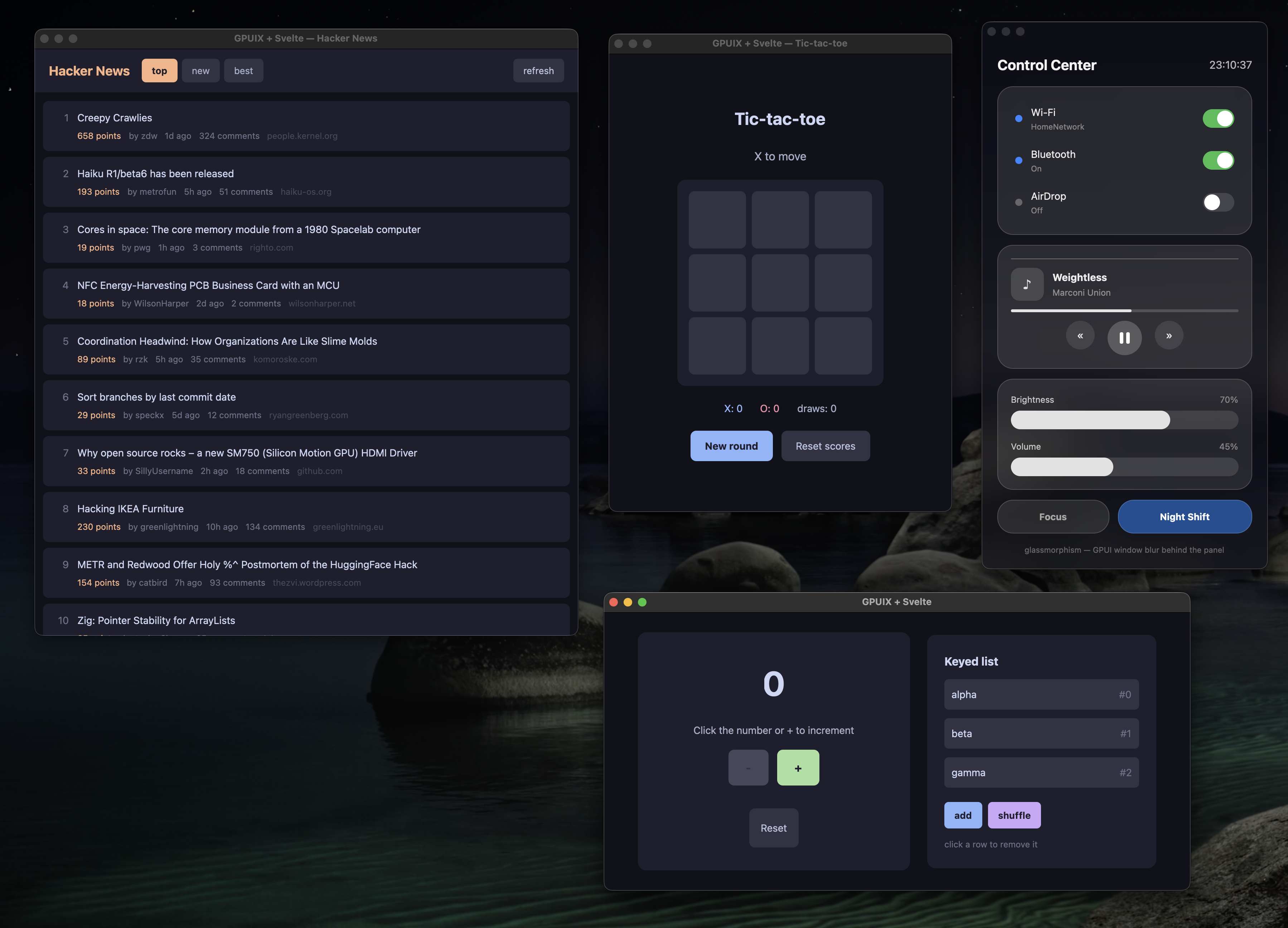
npm run demo:counter |
The counter, hot-reloading on save |
npm run demo:tictactoe |
Tic-tac-toe with score tracking |
npm run demo:hn |
Hacker News reader: live network data in a scrolling list |
npm run demo:glass |
A translucent control center over macOS vibrancy (demo:glass-ffi: real Liquid Glass via FFI, macOS 26+) |
npm run demo:styling |
Which CSS reaches GPUI and which is dropped, side by side |
npm run demo:desktop |
Window controls, file picker and drops, live image pixels, selection, focus, accessibility |
npm run demo:web |
Tic-tac-toe in a browser on GPUI's WebAssembly build (Bun) |
npm run tutorial |
A 12-step interactive guide to the renderer, itself a gpuix-svelte app |
Each of these, apart from demo:web (which always runs on Bun), has a Bun twin under a bun:
prefix, such as npm run bun:demo:counter.
Custom renderers live on an open Svelte pull request that moves on its own schedule. So each
release of this package bundles the exact build of that pull request it was tested against,
inside node_modules/gpuix-svelte/node_modules/svelte. Its loaders resolve every svelte import
(yours, the compiled components' and its own) to that copy.
In practice:
gpuix-svelteis your one dependency, and the Svelte you import is the one it brings. Keepsvelteitself out of yourpackage.json.- Upgrading
gpuix-sveltecan move the Svelte build underneath you, so read the changelog before a minor bump. svelte-checkinstalls the registry's Svelte as its own peer dependency and uses it to read your components. Thepathsentry in your tsconfig points type imports at the bundled build.
- Scrollbars come from
Scroller. Context menus are drawn by the app: aPopoverwithposition, or a<Portal>, placed at theonauxclickcoordinates. left,top,rightandbottomtake pixels only. A progress bar's fill sizes withwidth: 50%.<svg>takes itscolorfrom the nearest ancestor's style, which the renderer copies over. Hover is handled natively, so give hover tones to the<svg>itself.- Headless tests run on macOS and Windows.
- Standalone binaries and web bundles are built with Bun, from a script modelled on the repository's. See docs/shipping.md.
Svelte's custom renderer API hands the renderer DOM-shaped operations: create an element, insert it before an anchor, set an attribute, add a comment node. GPUI's tree is flat, keyed by numeric id, and holds elements and text. gpuix-svelte keeps a lightweight shadow tree in JavaScript and projects it onto GPUI. Only elements and non-blank text get native nodes, and they're created lazily, once they're attached to the window. Every change in a frame is queued and shipped as one batch, which Rust applies before the next paint.
Around that sit a .svelte loader for Node (module.registerHooks) and one for Bun
(Bun.plugin), which compile components with the renderer baked in and turn <style> blocks into
class rules. There's also a translator from CSS text to GPUI styles that expands shorthands and
drops what GPUI would reject, a ~125 fps frame loop, and in-process hot reload. The full design
notes are in CLAUDE.md.
See docs/contributing.md for running the demos and tests, moving the vendored Svelte build, and how releases are cut.
MIT
{
  "compilerOptions": {
    "module": "nodenext",
    "strict": true,
    "noEmit": true,
    "allowImportingTsExtensions": true,
    "erasableSyntaxOnly": true,
    "verbatimModuleSyntax": true,
    "customConditions": ["custom-renderer", "development"],
    "types": ["node", "gpuix-svelte/html"],
    "skipLibCheck": true,
    "paths": {
      "svelte": ["./node_modules/gpuix-svelte/node_modules/svelte"],
      "svelte/*": ["./node_modules/gpuix-svelte/node_modules/svelte/*"]
    }
  },
  "svelteOptions": { "namespace": "gpuixHTML" }
}