


SkiaSharp-powered color-picker controls for .NET MAUI: an interactive color wheel, a saturation/value triangle, HSL/RGB/alpha slider stacks, and a luminance-aware composite picker. Every control is vector-drawn (no bitmaps), DPI-independent, and fully data-bindable — and any number of pickers can be linked so they stay in sync.
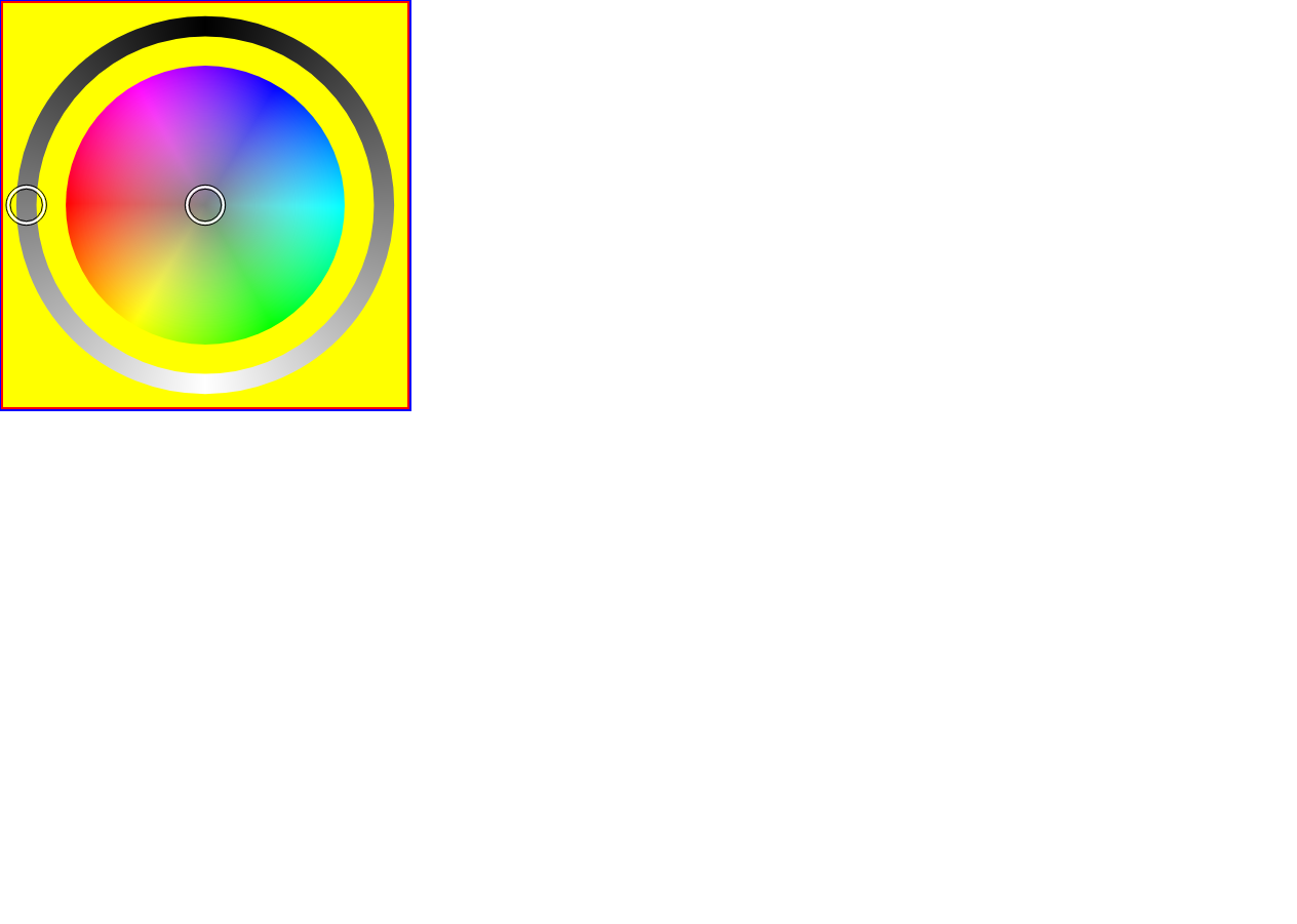
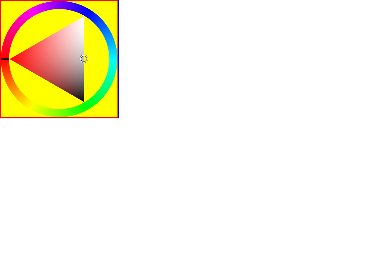
ColorWheel— hue/saturation disc with an optional luminosity ring, an optional luminosity slider, and an optional alpha slider.ColorTriangle— a saturation/value triangle that can rotate to follow the hue, with an optional alpha slider.ColorDisc— the raw hue/saturation disc (the wheel's core; usable on its own).- Sliders —
HslSlider,RgbSlider,AlphaSlider,LuminositySlider, plusDelegateSliderfor building custom single-channel sliders. - Two-way
SelectedColorbinding and aSelectedColorChangedevent. - Linked pickers — set
AttachedColorPickerand multiple controls edit the same color. - Fully customizable rendering — configure the bundled classic renderer or replace any visual element with your own SkiaSharp drawing code.
dotnet add package ColorPicker.MauiFor platform-independent color conversion and picker geometry without MAUI or SkiaSharp, install the companion package:
dotnet add package ColorPicker.Maui.CoreColorPicker.Maui.Core targets netstandard2.0 and net8.0. It is installed
transitively by ColorPicker.Maui; reference it directly only when using the
core APIs from a non-MAUI project.
A matching preview pair is published to GitHub Packages on every push to
main. StableColorPicker.MauiandColorPicker.Maui.Corereleases go to nuget.org and are versioned independently.
1. Register the controls (this also wires up SkiaSharp) in MauiProgram.cs:
using ColorPicker.Classes;

public static MauiApp CreateMauiApp()
{
    var builder = MauiApp.CreateBuilder();
    builder
        .UseMauiApp<App>()
        .UseColorPickersAndSliders();   // ColorPicker + SkiaSharp

    return builder.Build();
}
2. Add a control in XAML:
<ContentPage xmlns="http://schemas.microsoft.com/dotnet/2021/maui"
             xmlns:x="http://schemas.microsoft.com/winfx/2009/xaml"
             xmlns:cp="clr-namespace:ColorPicker.Controls;assembly=ColorPicker"
             x:Class="YourApp.MainPage">

    <cp:ColorWheel SelectedColor="{Binding PickedColor, Mode=TwoWay}"
                   ShowLuminosityRing="True"
                   ShowAlphaSlider="True"
                   WidthRequest="300"
                   HeightRequest="300" />

</ContentPage>
3. …or entirely in C#:
var wheel = new ColorWheel
{
    SelectedColor      = Colors.OrangeRed,
    ShowLuminositySlider = true,
    ShowAlphaSlider    = true,
};

wheel.SelectedColorChanged += (s, e) =>
Console.WriteLine($"{e.OldColor} -> {e.NewColor}");All pickers derive from ColorPickerBase and share these members:
| Member | Type | Default | Description |
|---|---|---|---|
SelectedColor |
Color |
HSL(0, 0, 0.5) (mid-gray) |
The current color. Bindable, two-way. |
AttachedColorPicker |
IColorPicker |
null |
Another picker to keep in sync with this one. |
Renderer |
IColorPickerRenderer |
ClassicColorPickerRenderer |
Draws every visual element; replace it globally or per control. |
SelectedColorChanged |
event |
— | Raised on change; args expose OldColor / NewColor. |
| Property | Type | Default | Description |
|---|---|---|---|
ShowLuminosityRing |
bool |
true |
Draw the luminosity ring around the disc. |
ShowLuminositySlider |
bool |
false |
Add a separate luminosity slider. |
ShowAlphaSlider |
bool |
false |
Add an alpha (opacity) slider. |
Vertical |
bool |
false |
Place attached sliders beside the wheel instead of below it. |
CanvasBackgroundColor |
Color |
Transparent |
Fill drawn behind the wheel. |
IndicatorRadiusScale |
float |
0.05 |
Picker-dot radius as a fraction of the canvas. |
| Property | Type | Default | Description |
|---|---|---|---|
RotateTriangleByHue |
bool |
true |
Rotate the S/V triangle so its hue corner follows the selected hue. |
ShowAlphaSlider |
bool |
false |
Add an alpha (opacity) slider. |
Vertical |
bool |
false |
Place the alpha slider beside the triangle instead of below it. |
CanvasBackgroundColor |
Color |
Transparent |
Fill drawn behind the triangle. |
IndicatorRadiusScale |
float |
0.035 |
Picker-dot radius as a fraction of the canvas. |
All picker geometry, color math, layout, and hit testing remain owned by the controls.
Rendering is delegated to an IColorPickerRenderer, which receives an SKCanvas and an
immutable semantic context containing the relevant pixel coordinates, radii, colors,
angles, normalized values, channel role, and interaction state.
The default ClassicColorPickerRenderer reproduces the standard appearance and exposes
bindable high-level properties:
<ContentPage
    ...
    xmlns:cp="clr-namespace:ColorPicker.Controls;assembly=ColorPicker"
    xmlns:cpr="clr-namespace:ColorPicker.Rendering;assembly=ColorPicker">

    <cp:ColorWheel>
        <cp:ColorWheel.Renderer>
            <cpr:ClassicColorPickerRenderer
                IndicatorOuterColor="DarkBlue"
                IndicatorOuterThickness="3"
                IndicatorHighlightColor="White"
                SliderTrackThicknessScale="1.5"
                AlphaPatternLightColor="LightGray"
                AlphaPatternDarkColor="White" />
        </cp:ColorWheel.Renderer>
    </cp:ColorWheel>
</ContentPage>
Common classic-renderer options include:
| Property group | Options |
|---|---|
| Indicator | Fill, outer/highlight/inner colors, outline thicknesses, and outline insets |
| Slider | Track-thickness scale, stroke cap, and stroke join |
| Alpha pattern | Light/dark colors and cell-size scale |
| Rings | Hue-ring and luminosity-ring thickness scales |
| Triangle hue marker | Color, thickness, and stroke cap |
| General | Antialiasing |
Renderer instances can also be placed in a resource dictionary and shared by controls. Use literal property values when sharing a renderer. A renderer with bindings should only be shared by controls that use the same binding context; renderer objects are not visual elements, so MAUI dynamic-resource lookup is not available on them.
To replace only one element, inherit the classic renderer and override the corresponding protected method. All other elements continue to use the classic implementation:
using ColorPicker.Rendering;
using SkiaSharp;

public sealed class SquareIndicatorRenderer : ClassicColorPickerRenderer
{
    protected override void DrawIndicator(
        SKCanvas canvas,
        IndicatorDrawingContext context)
    {
        using var paint = new SKPaint
        {
            Color = SKColors.White,
            Style = SKPaintStyle.Fill,
            IsAntialias = true,
        };

        var radius = context.Radius;
        canvas.DrawRect(
            context.Center.X - radius,
            context.Center.Y - radius,
            radius * 2,
            radius * 2,
            paint);
    }
}
For a completely independent visual language, inherit ColorPickerRenderer or implement
IColorPickerRenderer and handle each context directly. Bundled renderer source code is
also intended to serve as a complete implementation reference.
Set AttachedColorPicker to mirror the color between two (or more) controls — edit either
one and both update:
<VerticalStackLayout>
    <cp:ColorWheel    x:Name="Wheel" />
    <cp:ColorTriangle AttachedColorPicker="{x:Reference Wheel}" />
    <cp:RgbSlider     AttachedColorPicker="{x:Reference Wheel}" />
</VerticalStackLayout>Built for .NET 10 / .NET MAUI 10 — net10.0-android, net10.0-ios,
net10.0-maccatalyst, and net10.0-windows — with SkiaSharp 4.x.
# Requires the .NET 10 SDK (pinned in global.json) + the MAUI workloads.
dotnet build ColorPicker/ColorPicker.csproj -c Release -f net10.0-windows10.0.19041.0
See AGENTS.md for the full toolchain, CI layout, and net10 build notes, and
ColorPickerTestApp for a runnable sample that exercises every control.
MIT © Victor Papenko