Skip to content

Migrate HeaderWithBackButton to composed Header: Central Pane callsites - #102523

Open
Guccio163 wants to merge 36 commits into
Expensify:mainfrom
software-mansion-labs:Guccio163/header/centralPane
Open

Guccio163 wants to merge 36 commits into
Expensify:mainfrom
software-mansion-labs:Guccio163/header/centralPane

Conversation

@Guccio163

@Guccio163 Guccio163 commented Sep 29, 2026 •

Copy link
Copy Markdown
Contributor

Explanation of Change

Central Pane batch of the HeaderWithBackButton → composed Header migration. Adds a HeaderCentralPane preset (src/components/Header/composed/HeaderCentralPane.tsx) for Split Navigator root screens (Workspace/Settings/Domain): headline title, a back button on narrow layout only, and the help button, with an optional child slot (e.g. SearchButton on the Settings pages that need it).

32 root screens (all top-level Settings pages, the Domain pages, and every WorkspacePageWithSections-based workspace page) now use HeaderCentralPane. 31 non-root screens (workspace/rules/*, WalletStatementPage, ValidateCodeActionContent) keep the HeaderWithBackButtonAndTitle preset from an earlier batch. DynamicTripDetailsPage and VictoryChartExpandModal compose Header primitives directly since neither fits a preset. The now caller-less HeaderWithBackButtonComposed/HeaderWithBackButton.tsx drop-in is deleted. No behavior or visual change intended.

Fixed Issues

$ #102546
PROPOSAL:

Tests

Use a brand-new account (created with the one-click "Join"), finish onboarding (the help icon in the Header only appears after onboarding is completed), and create a workspace (Workspaces tab > New workspace). In Workspaces > workspace > More features enable Tags, Taxes, Rules, Distance rates and Per diem (the workspace is free to upgrade to the Control plan: Rules > Add rule > Upgrade).

Check every scenario on wide layout (desktop web) and narrow layout (mWeb / native, or a desktop window narrower than 480px). Wherever a step says "same as main", compare with main side by side.

How a Central Pane header looks

Left to right: [back button – narrow layout only] [title] [custom buttons, if any] [search icon – only where listed] [help icon].

  • A group of custom buttons with text (Add category, More, Invite member, Settings…) is followed by exactly 8px of space before the next element (the help icon, or the edge of the header). The buttons inside the group are separated by their own 8px gap. Same as main.
  • Icon buttons (search, help) have no space after them and sit directly next to each other. Same as main.
  • On narrow layout (portrait) the buttons with text are not in the header. They are in a row under the header, with the page gutter on the left and right, and no extra space after them. Same as main.
  • The only intentional change: if a header has no buttons with text, the gap between a truncated title and the first icon to its right is 8px (on main it was 16px). It is only visible when the title is long enough to be cut off.

1. Account pages with search and help icons

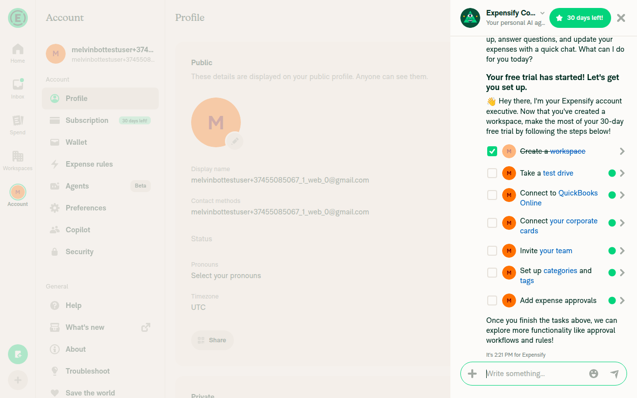
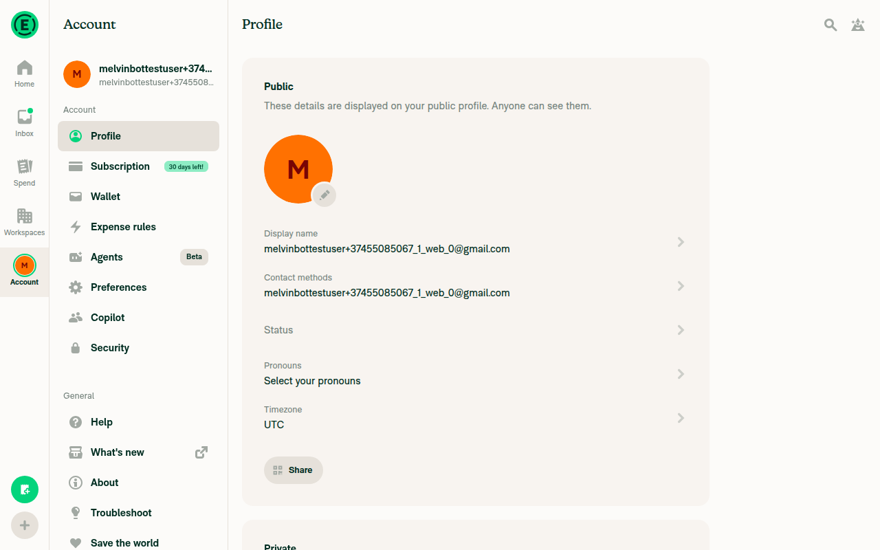
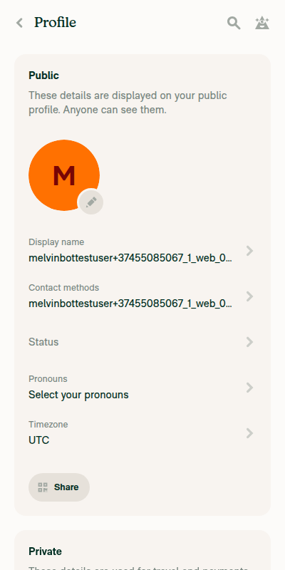
Open the Account tab and then, one by one: Profile, Subscription, Wallet, Preferences, Copilot, Security, Help, About, Troubleshoot, Save the world.

  1. Wide: title on the left, no back button. On the right the search icon and the help icon touch each other. Same as main.
  2. Narrow: back button, title, search icon, help icon. Same as main.
  3. Narrow the browser window to about 250px on Troubleshoot. The title is cut off with an ellipsis and ends 8px before the search icon (16px on main).

2. Workspace pages with only the help icon

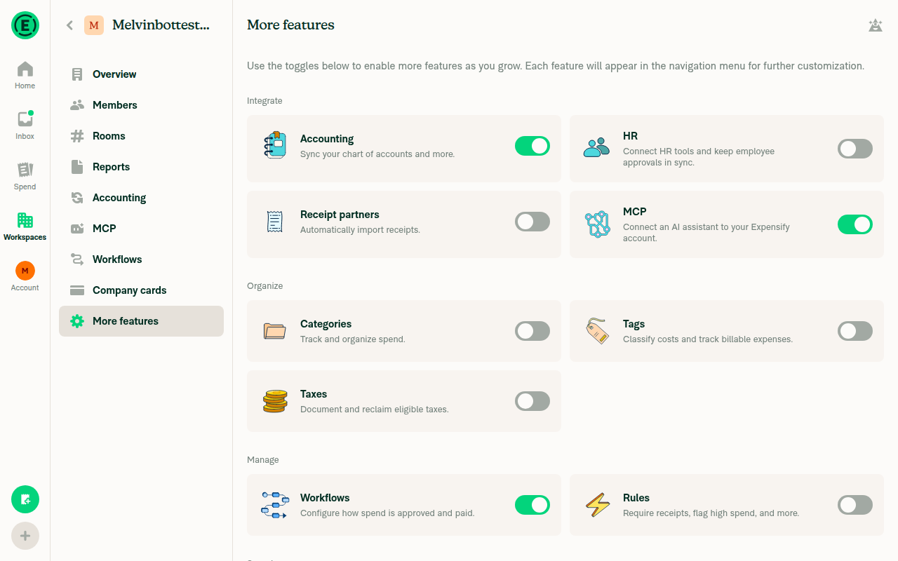
Open Workspaces > workspace > Reports, Connections, More features.

  1. Wide: title on the left, only the help icon on the right. Same as main.
  2. Narrow: back button, title, help icon. Same as main.

3. Buttons with text in the header (wide layout)

On each page the buttons are on the same row as the title, to its right, and there are 8px between the last button and the help icon. The title is fully visible. Same as main.

  • Workspaces > workspace > Overview: Invite, More.
  • Workspaces > workspace > Members: Invite member, More.
  • Workspaces > workspace > Rooms: Create.
  • Workspaces > workspace > Categories: Add category, More.
  • Workspaces > workspace > Tags: More.
  • Workspaces > workspace > Taxes: Add rate, Settings (the title "Taxes" must stay visible).
  • Workspaces > workspace > Rules: Add rule, More.
  • Workspaces > workspace > Distance rates: Add rate, Settings (the title must stay visible).
  • Workspaces > workspace > Per diem: More.
  • Account > Expense rules: New rule. It is in the header only once at least one rule exists, so first create one with New rule (merchant "Acme", change merchant to "Acme Co", Save rule). Before that the button is in the middle of the empty page.
  • Account > Agents: New agent (search icon and help icon follow it). Same: it is in the header only once an agent exists, so first create one with New agent > Add on a template > Create agent.

4. The same pages in narrow layout

The buttons are not in the header. They are in a row under it (full width for a single button, side by side for two), with the page gutter on the left and right. The header shows only the back button, title, search icon (Account pages) and help icon. Same as main.

On Rooms, Create is a full-width button above the "Find room" field. Same as main.

5. Landscape on a phone

Rotate a phone or emulator to landscape and open Workspaces > workspace > Members and Taxes.

  1. The buttons are in the header row to the right of the title, with 8px after the last one before the help icon. The title is visible.
  2. No row of buttons under the header. Same as main.

6. Selection mode

  1. Wide, Workspaces > workspace > Categories (also Distance rates, and Account > Expense rules after creating a rule): tick one row. The title stays the same. The header shows a green 1 selected dropdown instead of the buttons, followed by 8px and the help icon. Same as main.
  2. Narrow, Categories: long-press a category and choose Select. The title changes to "Select multiple" in a smaller bold font, the green 1 selected dropdown is a full-width row under the header, and the back button leaves selection mode (the buttons come back). Same as main.

7. Expense defaults rule

Go to Workspaces > workspace > Rules > Add rule > Apply expense defaults > Merchant. The header (in the right-hand panel) shows the back button and the title. In "If any expense matches" tap Merchant, type "Starbucks" and Save. A blue Reset link appears at the right edge of the panel header. It has 8px of padding around the text, so its tap area is the same as on main.

8. Header with only a back button

Go to Account > Profile > Contact methods > New contact method. In the "Validate your account" panel the header shows only the back button and the title. Same as main.

  • Verify that no errors appear in the JS console

Offline tests

QA Steps

Same as tests

PR Author Checklist

  • I linked the correct issue in the ### Fixed Issues section above
  • I wrote clear testing steps that cover the changes made in this PR
    • I added steps for local testing in the Tests section
    • I added steps for the expected offline behavior in the Offline steps section
    • I added steps for Staging and/or Production testing in the QA steps section
    • I added steps to cover failure scenarios (i.e. verify an input displays the correct error message if the entered data is not correct)
    • I turned off my network connection and tested it while offline to ensure it matches the expected behavior (i.e. verify the default avatar icon is displayed if app is offline)
    • I tested this PR with a High Traffic account against the staging or production API to ensure there are no regressions (e.g. long loading states that impact usability).
  • I included screenshots or videos for tests on all platforms
  • I ran the tests on all platforms & verified they passed on:
    • Android: Native
    • Android: mWeb Chrome
    • iOS: Native
    • iOS: mWeb Safari
    • MacOS: Chrome / Safari
  • I verified there are no console errors (if there's a console error not related to the PR, report it or open an issue for it to be fixed)
  • I followed proper code patterns (see Reviewing the code)
    • I verified that comments were added to code that is not self explanatory
    • I verified that any new or modified comments were clear, correct English, and explained "why" the code was doing something instead of only explaining "what" the code was doing.
    • I verified any copy / text that was added to the app is grammatically correct in English. It adheres to proper capitalization guidelines (note: only the first word of header/labels should be capitalized), and is either coming verbatim from figma or has been approved by marketing (in order to get marketing approval, ask the Bug Zero team member to add the Waiting for copy label to the issue)
  • If a new code pattern is added I verified it was agreed to be used by multiple Expensify engineers
  • I followed the guidelines as stated in the Review Guidelines
  • I tested other components that can be impacted by my changes (i.e. if the PR modifies a shared library or component like Avatar, I verified the components using Avatar are working as expected)
  • If a new CSS style is added I verified that:
    • A similar style doesn't already exist
    • The style can't be created with an existing StyleUtils function (i.e. StyleUtils.getBackgroundAndBorderStyle(theme.componentBG))
  • If new assets were added or existing ones were modified, I verified that:
    • The assets are optimized and compressed (for SVG files, run npm run compress-svg)
    • The assets load correctly across all supported platforms.
  • If the PR modifies code that runs when editing or sending messages, I tested and verified there is no unexpected behavior for all supported markdown - URLs, single line code, code blocks, quotes, headings, bold, strikethrough, and italic.
  • If the PR modifies a generic component, I tested and verified that those changes do not break usages of that component in the rest of the App (i.e. if a shared library or component like Avatar is modified, I verified that Avatar is working as expected in all cases)
  • If the PR modifies a component related to any of the existing Storybook stories, I tested and verified all stories for that component are still working as expected.
  • If the PR modifies a component or page that can be accessed by a direct deeplink, I verified that the code functions as expected when the deeplink is used - from a logged in and logged out account.
  • If the PR modifies the UI (e.g. new buttons, new UI components, changing the padding/spacing/sizing, moving components, etc) or modifies the form input styles:
    • I verified that all the inputs inside a form are aligned with each other.
    • I added Design label and/or tagged @Expensify/design so the design team can review the changes.
  • If the PR adds or modifies the UI:
    • I asked an AI agent to review the changes for accessibility issues and addressed its findings.
    • I tested with a screen reader (VoiceOver on macOS) and verified all new/changed elements are reachable with a logical focus order.
    • I verified all new/changed elements have meaningful accessible names and roles.
    • I verified state changes are announced (e.g. checked/unchecked, expanded/collapsed, selected).
  • I added unit tests for any new feature or bug fix in this PR to help automatically prevent regressions in this user flow.
  • If the main branch was merged into this PR after a review, I tested again and verified the outcome was still expected according to the Test steps.

Screenshots/Videos

Android: Native
android-profile-searchbutton-header.mp4
android-categories-nochild-header.mp4
Android: mWeb Chrome
iOS: Native
ios-profile-searchbutton-header.mp4
ios-categories-nochild-header.mp4
iOS: mWeb Safari
MacOS: Chrome / Safari
web-profile-searchbutton-header.mp4
web-categories-nochild-header.mp4

@Guccio163 Guccio163 changed the title Guccio163/header/central pane Migrate HeaderWithBackButton to composed Header: Central Pane callsites Sep 29, 2026
@codecov

codecov Bot commented Sep 29, 2026 •

Copy link
Copy Markdown

Codecov Report

❌ Looks like you've decreased code coverage for some files. Please write tests to increase, or at least maintain, the existing level of code coverage. See our documentation here for how to interpret this table.

Files with missing lines Coverage Δ
...artRenderer/components/VictoryChartExpandModal.tsx 88.37% <100.00%> (ø)
src/components/Header/Header.tsx 100.00% <100.00%> (ø)
...c/components/Header/composed/HeaderCentralPane.tsx 100.00% <100.00%> (ø)
...s/Header/composed/HeaderWithBackButtonAndTitle.tsx 100.00% <100.00%> (ø)
src/components/Header/index.tsx 100.00% <ø> (ø)
src/components/Header/primitives/HeaderTitle.tsx 100.00% <100.00%> (ø)
...idateCodeActionModal/ValidateCodeActionContent.tsx 98.00% <100.00%> (-0.04%) ⬇️
src/pages/domain/DomainSamlPage.tsx 86.66% <100.00%> (-0.57%) ⬇️
src/pages/domain/Members/DomainMembersPage.tsx 61.42% <100.00%> (+0.71%) ⬆️
src/pages/settings/AboutPage/AboutPage.tsx 0.00% <ø> (ø)
... and 33 more
... and 13 files with indirect coverage changes

…labs/expensify-app-fork into Guccio163/header/centralPane
Guccio163 and others added 3 commits September 30, 2026 10:17
…WithBackButtonAndTitle

Pulls the part2 changes into this branch. HeaderCentralPane keeps its
own isHeadline prop (its 9 call sites still pass it) but now applies
textHeadlineH2 via titleStyles internally instead of forwarding
isHeadline to HeaderTitle, since the primitive no longer supports it.

Co-Authored-By: Claude Sonnet 5 <noreply@anthropic.com>
@Guccio163
Guccio163 marked this pull request as ready for review October 1, 2026 09:08
@Guccio163
Guccio163 requested review from a team as code owners October 1, 2026 09:08
@melvin-bot
melvin-bot Bot requested review from gijoe0295 and trjExpensify and removed request for a team October 1, 2026 09:08
@melvin-bot

melvin-bot Bot commented Oct 1, 2026

Copy link
Copy Markdown

@gijoe0295 Please copy/paste the Reviewer Checklist from here into a new comment on this PR and complete it. If you have the K2 extension, you can simply click: [this button]

@melvin-bot
melvin-bot Bot removed the request for review from a team October 1, 2026 09:08
@trjExpensify

Copy link
Copy Markdown
Contributor

PR doesn’t need product input as a refactor PR. Unassigning and unsubscribing myself.

@trjExpensify
trjExpensify removed their request for review October 1, 2026 16:38
@gijoe0295

Copy link
Copy Markdown
Contributor

@MelvinBot Review this PR following these items:

  • If the PR adds or modifies the UI:
    • I asked an AI agent to review the changes for accessibility issues and addressed its findings.
    • I tested with a screen reader (VoiceOver on macOS) and verified all new/changed elements are reachable with a logical focus order.
    • I verified all new/changed elements have meaningful accessible names and roles.
    • I verified state changes are announced (e.g. checked/unchecked, expanded/collapsed, selected).

@MelvinBot

MelvinBot commented Oct 6, 2026 •

Copy link
Copy Markdown
Contributor

🤖 Web test steps verification results: ⚠️ partial

I found no accessibility regressions. HeaderCentralPane renders the same back button, title, Search and Help components as HeaderWithBackButton, with the same roles, names, and order. I couldn't run VoiceOver or a live Tab-key trace here. The Help button exposes no expanded state, but that was already true on main.
Side panel open after clicking Help

Step Status
Settings > Profile (wide): the title is a heading, and Search and Help have accessible names (checklist: names and roles)DOM shows heading "Profile", button "Search", and button "Help". The title still uses accessibilityRole=header through HeaderTitleText.tsx:27-28.
Profile wide header with heading, Search and Help
✅
Settings > Profile: logical focus order (checklist: focus order)The tooling can't send Tab keypresses on web, so I checked DOM order only. That order is title → Search → Help. It matches the code: back → title → children → SearchButton → SidePanelButton in HeaderCentralPane.tsx:32-41, which is the same order as the old header. On pages with buttons, such as Agents, the page buttons still come before Search.
⚠️
Narrow layout (400px): the Back button appears first, with role and nameThe first node is button "Back", ahead of heading "Profile", Search and Help. Its label, role, tooltip and native ID match the old header (HeaderIconButton.tsx:46-54). With no handler passed, onPress still defaults to Navigation.goBack().
Profile narrow header with Back button first
✅
Workspace > More features: the title is a heading, Help is present, and Search is absentDOM shows heading "More features" and button "Help". No Search button appears in the wide or narrow layout.
More features header with heading and Help, no Search
✅
Help toggles the side panel and announces its state (checklist: state changes)Help opens the side panel. The button exposes only role and name, with no aria-expanded or aria-pressed, both before and after (SidePanelButtonBase.tsx:31-36). This component isn't changed by this PR. The "Select multiple" title swap has no live region before or after the change either.
Side panel open after clicking Help
⚠️

Not accessibility, but it contradicts "no visual change": the old header wrapped children in a pr2 View (HeaderWithBackButton/index.tsx:278). HeaderCentralPane doesn't. So on pages with header buttons, such as Domain Admins, Agents and Categories, the 8px gap before Search and Help is gone.


view run · view recording

@gijoe0295

gijoe0295 commented Oct 6, 2026 •

Copy link
Copy Markdown
Contributor

Bug: No Help on Distance rates page

Dev

Screenshot 2026-10-06 at 21 58 06

Stag

Screenshot 2026-10-06 at 21 58 09

Not accessibility, but it contradicts "no visual change": the old header wrapped children in a pr2 View (HeaderWithBackButton/index.tsx:278). HeaderCentralPane doesn't. So on pages with header buttons, such as Domain Admins, Agents and Categories, the 8px gap before Search and Help is gone.

Melvin flagged this too.

@gijoe0295

Copy link
Copy Markdown
Contributor

Bug: Missing 8px padding between header actions and help

Dev

Screenshot 2026-10-06 at 22 01 04

Stag

Screenshot 2026-10-06 at 22 00 28

@gijoe0295 gijoe0295 left a comment

Copy link
Copy Markdown
Contributor

Choose a reason for hiding this comment

The reason will be displayed to describe this comment to others. Learn more.

Some test cleanups:

  1. Several tests still mock @components/HeaderWithBackButton, so those mocks no longer do anything: AgentsPageTest, CopilotPageTest,TroubleshootPageTest, PolicyAccountingPageAutoStartFlowTest and PolicyAccountingPageQBOTokenExpiryTest.
  2. The icon prop in this mock is not needed

@gijoe0295

gijoe0295 commented Oct 6, 2026 •

Copy link
Copy Markdown
Contributor

Bug: (Accessibility) Back button tap area shrinks because we use a negative margin

Screen.Recording.2026-10-06.at.22.12.06.mov

The left side of focus ring is lost too:

Screenshot 2026-10-06 at 22 16 29

Compared to Stag:

Screenshot 2026-10-06 at 22 16 10

…ralPane

# Conflicts:
#	src/pages/workspace/perDiem/WorkspacePerDiemPage.tsx
#	src/pages/workspace/tags/WorkspaceTagsPage.tsx
#	src/pages/workspace/vendors/WorkspaceVendorsPage.tsx
@Guccio163

Copy link
Copy Markdown
Contributor Author

Hi @shawnborton @dannymcclain @dubielzyk-expensify , before moving on to the follow-up callsites I created a real-life scenario to show where the new design stands:

  • A: Narrow screen (only download button, close icon hides):
Screenshot 2026-10-27 at 13 43 51
  • B: Custom actions ('download') separated from trailing item(s)), now with 12px:
Screenshot 2026-10-27 at 14 53 56
  • C: All children side by side:
Screenshot 2026-10-27 at 13 44 46

In this scenario I think the two icons look better further apart, but when Download is the only item, it doesn't need to space itself from the right edge. We can use this freedom to decide when we need this padding (keep separating custom actions from trailing items) and when it's redundant. Children shouldn't get right padding when they have nothing to separate from. If they end up too close to the border, they probably need a bigger padding of their own, just like the icons have now.

Also @dubielzyk-expensify I think that the three-dot icon is narrowed by design. Nevertheless, design choices can change 😄 I'm happy to adjust it based on your feedback!

To sum up, I'd love your input on the points above and to consult you on the follow-ups to make sure that the non-obvious callsites are handled correctly. Should I tag all of you, or only one of you?

@shawnborton

Copy link
Copy Markdown
Contributor

Feel free to tag all of us!

In this scenario I think the two icons look better further apart, but when Download is the only item, it doesn't need to space itself from the right edge.

From your examples, C felt a little nicer to me?

@dubielzyk-expensify

Copy link
Copy Markdown
Contributor

Agree C feels the best as well.

Also @dubielzyk-expensify I think that the three-dot icon is narrowed by design.

Do we know why? I don't see why we'd have 40x40 on other icons but one icon gets 20x40 tap target

@Guccio163

Copy link
Copy Markdown
Contributor Author

C felt a little nicer to me?
Agree C feels the best as well.

That's great news, because the C scenario is the clearer one! I went back through Header style evolution and it looks like the extra padding between custom children and those passed through options (three-dot, search, help etc.) is somewhat an oversight: what once was a 20px right padding became separate 8px gap inside and 12px padding right, through a couple of changes across 5 years. Since we agreed on 12px after-title padding, I propose we ditch the 8px gap and continue with a clearer design:

Screenshot 2026-10-28 at 19 31 26

This way, we can apply extra padding just where it is needed because of the custom children’s design and dimensions. I'm really curious WDYT about this, I personally always figured why did we end splitting those two after-title groups of children 🤔

one icon gets 20x40 tap target

This change was introduced by @daledah's b75d284 commit fixing three-dot and RBR spacing in this PR:
Screenshot 2026-10-28 at 10 31 53

I'm not sure whether we should tinker with hitSlop, because it could mess with neighbours' pressability in the overlapping area - f.ex. Close icon button seen below 👇. Nevertheless we can bring three-dot's width back to 40px just for the Header if you prefer. It would look like this then:

Current:
Screenshot 2026-10-28 at 09 51 39
Screenshot 2026-10-28 at 09 53 55

After width change:
Screenshot 2026-10-28 at 09 51 48
Screenshot 2026-10-28 at 09 53 35

cc: @shawnborton @dubielzyk-expensify @dannymcclain

@shawnborton

Copy link
Copy Markdown
Contributor

Yes, let's definitely fix that three dots icon in the header!

@Guccio163

Copy link
Copy Markdown
Contributor Author

Great thank you! I'll go forward with the simplified design, bring three-dot back to 40px width and will tag you all in the follow-up PRs!

…-fork into Guccio163/header/centralPane

# Conflicts:
#	src/pages/workspace/accounting/PolicyAccountingPage.tsx
#	src/pages/workspace/mcp/WorkspaceMCPPage.tsx
#	src/pages/workspace/merge/MergeConnectionsPageBase.tsx
#	src/pages/workspace/receiptPartners/WorkspaceReceiptPartnersPage.tsx
#	tests/unit/PolicyAccountingPageAutoStartFlowTest.tsx
@Guccio163

Copy link
Copy Markdown
Contributor Author

Hi, below I'm attaching screehshots of some of the migrated pages in this PR:

Most of the affected pages have 1 or 2 custom buttons that align with trailing icon on wide screen and position below in narrow screens. Most of them also have Concierge icon:

Wide screen

Screenshot 2026-11-06 at 16 39 57 Screenshot 2026-11-06 at 16 42 51 Screenshot 2026-11-06 at 16 39 45

Narrow screen (unaffected)

Screenshot 2026-11-06 at 16 44 45

With extra search icon

Screenshot 2026-11-06 at 16 44 03 Screenshot 2026-11-06 at 16 58 33

Other

We have also screens that don't have Concierge icon, but custom children aligned right, including requested three-dot menu icon:

Screenshot 2026-11-06 at 16 52 55 Screenshot 2026-11-06 at 16 53 32 Screenshot 2026-11-06 at 17 02 35

WDYT?

@Guccio163

Copy link
Copy Markdown
Contributor Author

@gijoe0295 this one (and the rest of the sub-issues) will be ready to pick up once designers sign off on the designs. Will you be available to help me push them forward over next week?

@shawnborton

Copy link
Copy Markdown
Contributor

These buttons feel too close to the Concierge icon. Can we add some more gap between the button wrapper (the gap between buttons is fine) and the icons on the right?
Uploading CleanShot 2026-11-06 at 8.59.09 PM@2x.png…

@shawnborton

Copy link
Copy Markdown
Contributor

These buttons feel too close to the Concierge icon. Can we add some more gap between the button wrapper (the gap between buttons is fine) and the icons on the right?
CleanShot 2026-11-06 at 8 59 09 PM@2x

@shawnborton

Copy link
Copy Markdown
Contributor

Also just to confirm, the bottom parts of the screenshots above are like... Claude generated or something? They don't look like our UI so just confirming.

@gijoe0295

Copy link
Copy Markdown
Contributor

@gijoe0295 this one (and the rest of the sub-issues) will be ready to pick up once designers sign off on the designs. Will you be available to help me push them forward over next week?

Yes. Sure

Custom buttons rendered inside the Header row now get 8px right padding
(pr2) after the whole group, only when they are not displayed in a
separate line under the Header. Drop redundant flexRow/w100 wrappers
that collapsed the title on wide layouts.
@Guccio163

Copy link
Copy Markdown
Contributor Author

@shawnborton The PR is ready, below I drop screenshots of the typical migrated callsites (for which the test-steps are written)

1. Account page: search + help icons 1-account-troubleshoot-wide
2. Workspace page: help icon only 2-workspace-reports-wide
Details< 3-workspace-taxes-wide summary>3. Buttons in the Header, wide (Taxes)
4. Buttons under the Header, narrow (Taxes) 4-workspace-taxes-narrow
5. Landscape on a phone (Taxes, Members) 5-android-landscape-members
6. Selection mode, wide and narrow (Categories) 6a-categories-selection-wide 6b-categories-selection-narrow
7. Reset link in the Expense defaults panel 7-expense-defaults-reset
8. "Validate your account" panel (back button + title only) 8-validate-account-header

like... Claude generated or something

Ah, busted! Yes, those are from generated views to easily navigate between different Header compositions, they are exact copies of the real callsites 🪞

@Guccio163

Copy link
Copy Markdown
Contributor Author

@gijoe0295 ready for review ✅

@shawnborton

Copy link
Copy Markdown
Contributor

Looking good to me 👍

@Guccio163

Copy link
Copy Markdown
Contributor Author

@gijoe0295 how is review going?

@gijoe0295

Copy link
Copy Markdown
Contributor

On my list today. Catching up the context.

This branch has not been deployed

No deployments
Sign up for free to join this conversation on GitHub. Already have an account? Sign in to comment

Labels

None yet

Projects

None yet

Development

Successfully merging this pull request may close these issues.

7 participants