Repository navigation
Conversation


Co-authored-by: Pujan Shah <Pujan92@users.noreply.github.com>

 melvin-bot
Bot
added
Melvin-Test-Android
Melvin-Test-Web


Codex Review Summary: ✅ CompletedThis comment shows the latest Codex review activity on this pull request.
ℹ️ About Codex in GitHubYour team has set up Codex to review pull requests in this repo. Reviews are triggered when you
Codex reacts with 👀 while any review is running, comments if it has suggestions, and reacts with 👍 once all reviews finish with no findings. |

|
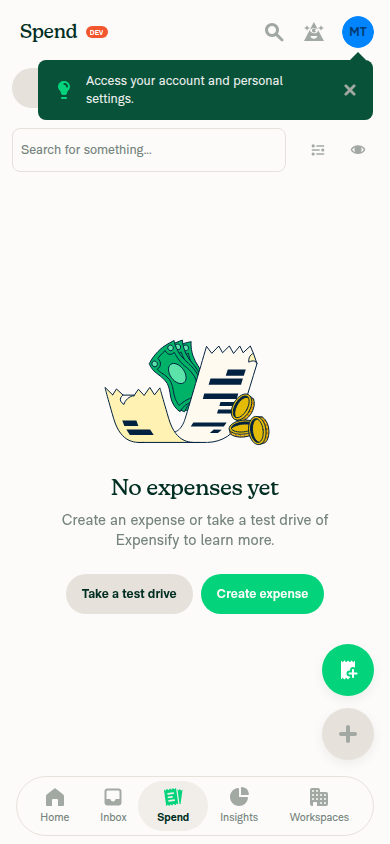
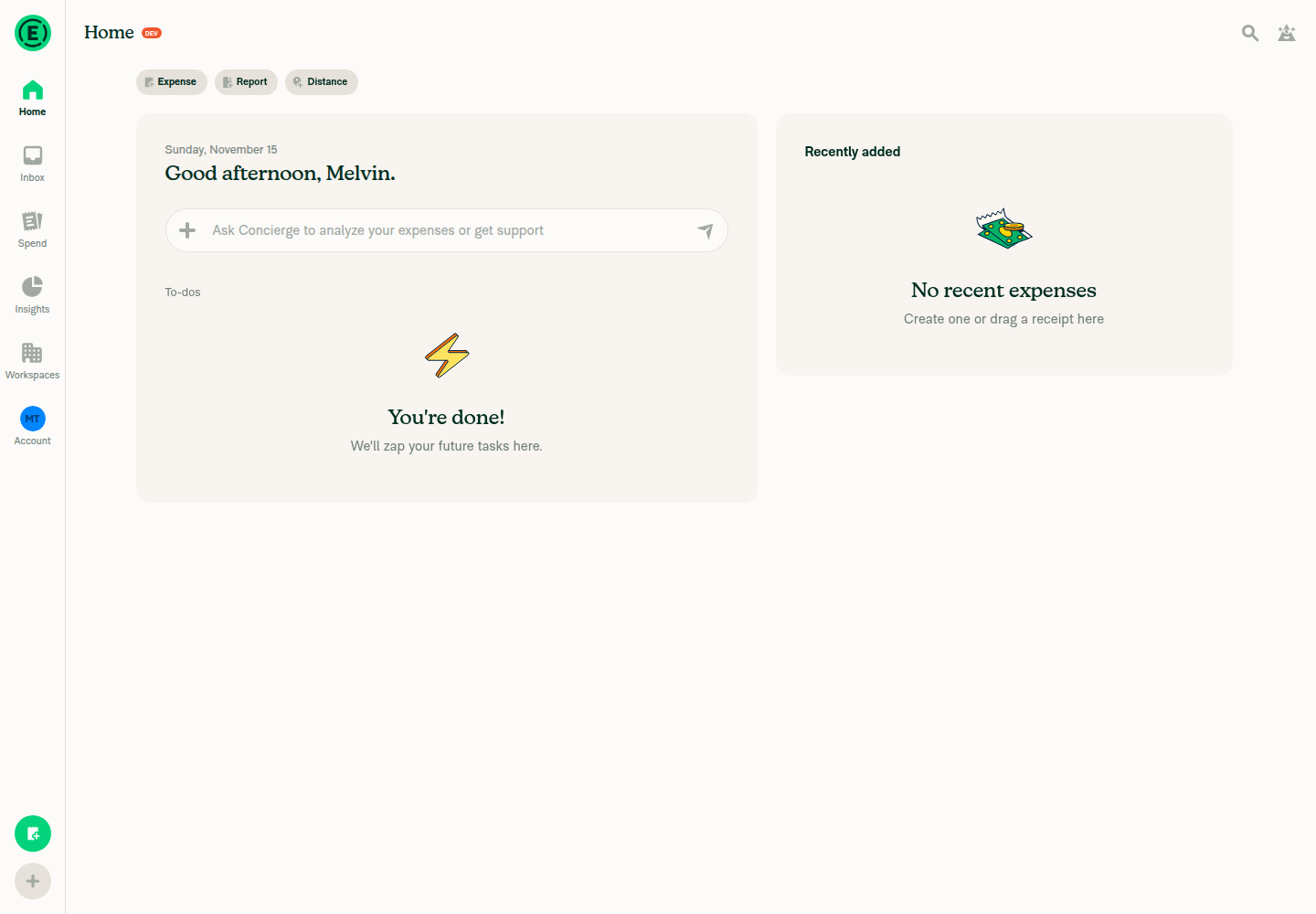
🤖 Web test steps verification results: Tested dev NewDot web at 1440×1000 and 390×844, but verification remained incomplete after Date-filter interaction failures; no product regression or production visual parity was established.
|

| /** Whether the row responds to interactions */ | ||
| isInteractive: boolean; | ||
|
|
||
| isCompact: boolean; |

There was a problem hiding this comment.
❌ CONSISTENCY-10 (docs)
The new isCompact member is added to MenuItemConfig with no /** ... */ comment, while every sibling in this type is documented. Its meaning is non-obvious: unlike isCompactPopover, it selects legacy compact row sizing independently of the compact-popover breakpoint, which is exactly the kind of sibling distinction that needs a comment.
Document it the same way the prop is documented in MenuItemRoot.tsx:
/** Whether the row uses legacy compact sizing, independently of compact-popover styling */
isCompact: boolean;
Reviewed at: 871036f | Please rate this suggestion with 👍 or 👎 to help us improve! Reactions are used to monitor reviewer efficiency.

Codecov Report✅ Changes either increased or maintained existing code coverage, great job!
|
|
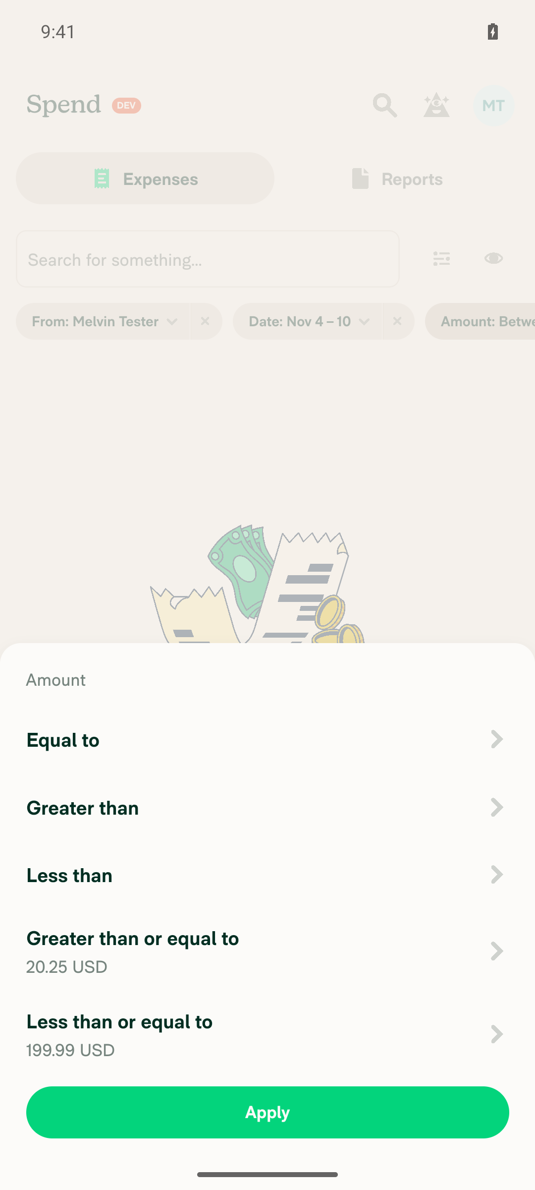
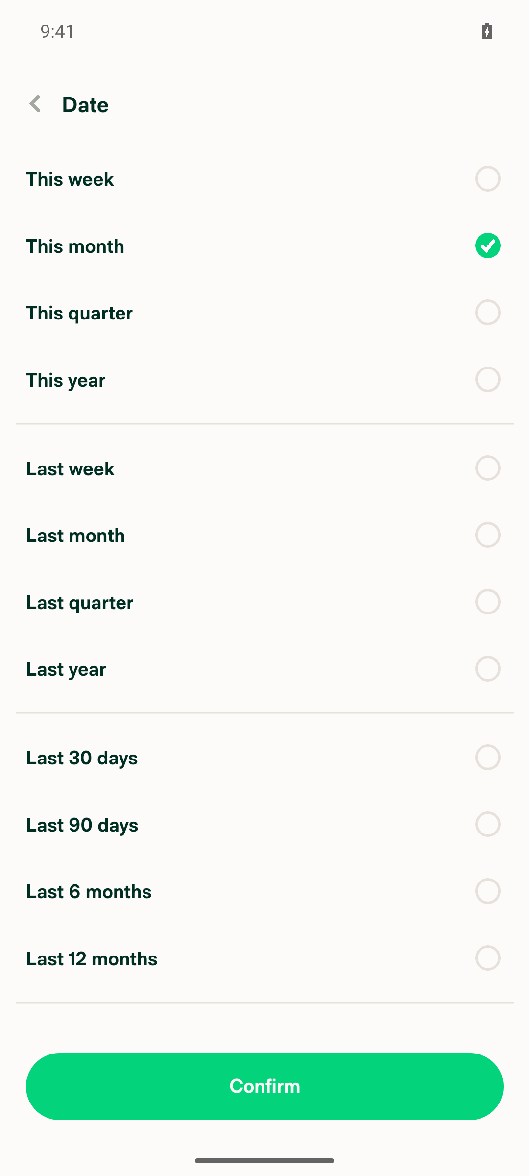
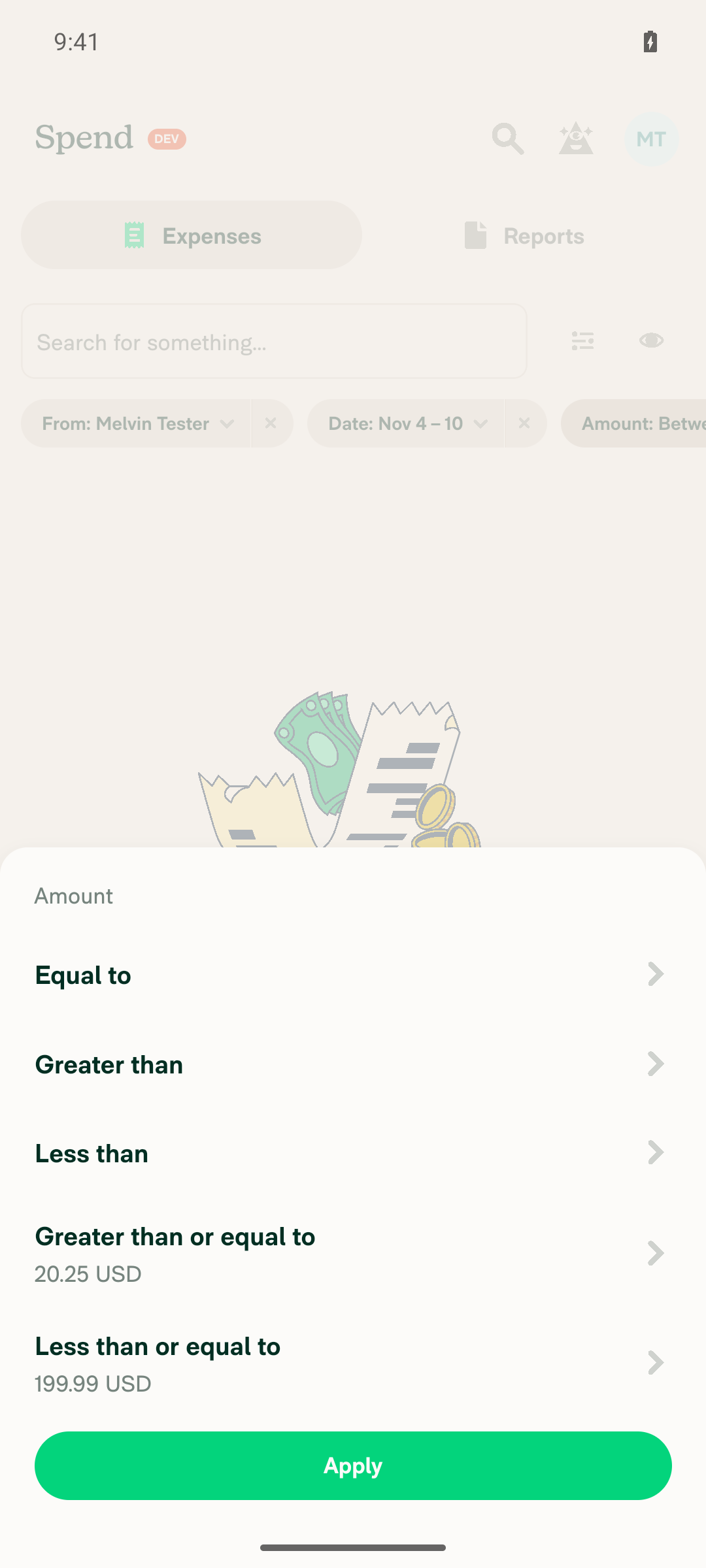
🤖 Android test steps verification results: Date and Amount flows were partially verified on standalone Android NewDot before the testing step limit was reached; no product defect was established. Production visual comparison was unavailable.
|
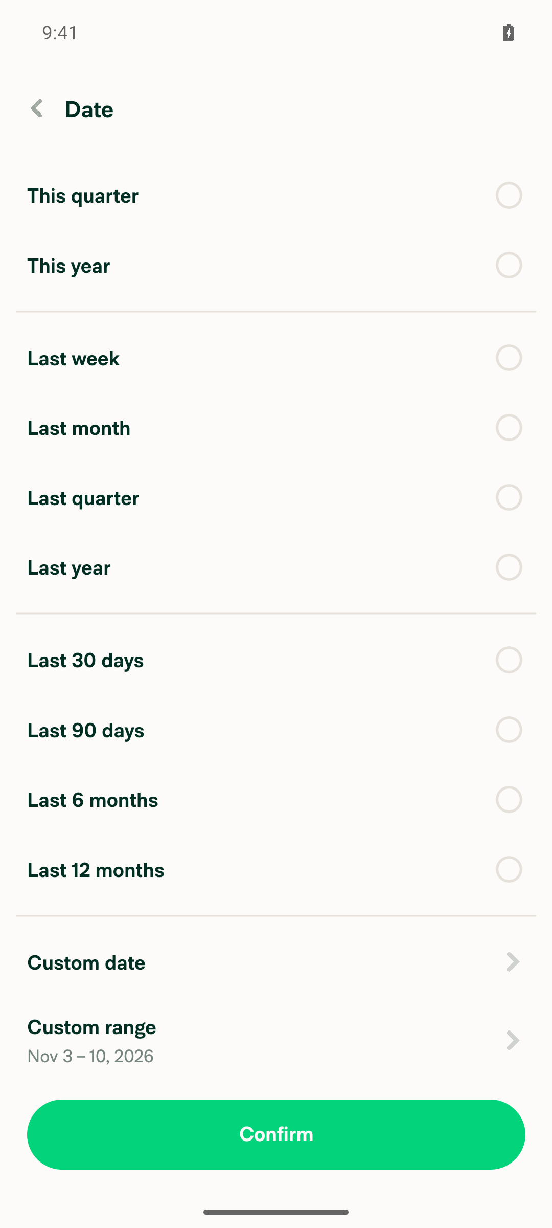

 twisterdotcom
left a comment
twisterdotcom
left a comment
There was a problem hiding this comment.
No product review required. This is a component migration.


Explanation of Change
Adds
isCompacttoMenuItem.Rootto preserve legacy compact sizing while migrating the six requested JSX sites to composition:The pressable applies
alignItemsCenterandoptionRowCompact. Context shares compactness withMenuItem.Content, which usesgetMenuItemTextContainerStyle(isCompactPopover || isCompact)without adding astyleprop.MenuItem.Trailinguses the same flag so a chevron's normal minimum height cannot enlarge an otherwise compact row. Existing Sentry labels, actions/authentication gates, chevrons, and selection lists/checkmarks are preserved. Removes the five deprecation seatbelt entries covering the six sites.AI Tests
oxfmtrun on all 10 changed TSX files.check-changedcould not resolveorigin/because the base-ref variable is empty in this environment; direct per-component compiler checks passed instead.prettiernpm script no longer exists; formatting was performed successfully by theoxfmtcommit hook.Contributor branch ownership
This PR uses an upstream branch because Melvin cannot push to
Pujan92's fork. To copy it to your fork:You can then close this PR and open one from your fork if desired.
Fixed Issues
$ #100312
PROPOSAL: #100312 (comment)
Tests
// TODO: The human co-author must fill out the tests they ran. Automated checks and the blocked browser attempt are recorded in AI Tests above.
Offline tests
QA Steps
Run these checks on wide desktop web and narrow mobile web, then on supported native platforms. These are proposed QA steps, not completed manual verification. Compare row heights, text spacing, and hover/pressed feedback with the current production build.
PR Author Checklist
### Fixed Issuessection aboveTestssectionOffline stepssectionQA stepssectionAvatar, I verified the components usingAvatarare working as expected)npm run compress-svg)Avataris modified, I verified thatAvataris working as expected in all cases)Designlabel and/or tagged@Expensify/designso the design team can review the changes.mainbranch was merged into this PR after a review, I tested again and verified the outcome was still expected according to theTeststeps.Screenshots/Videos
Android: Native
Android: mWeb Chrome
iOS: Native
iOS: mWeb Safari
MacOS: Chrome / Safari
Browser testing was blocked before any product assertion could be verified: