Skip to content

Fix edit composer height to match the main composer - #99193

Merged
mollfpr merged 3 commits into
mainfrom
claude-editComposerHeight
Aug 24, 2026
Merged

mollfpr merged 3 commits into
mainfrom
claude-editComposerHeight

Conversation

@MelvinBot

@MelvinBot MelvinBot commented Aug 21, 2026 •

Copy link
Copy Markdown
Contributor

Explanation of Change

Deploy blocker: the message edit composer renders slightly taller than the main composer (introduced in 9.4.58, staging-only).

Root cause: PR #98781 grew the shared composerSizeButton from 32×32 to 40×40. The edit composer's cancel (X) button — unlike the main composer's + button, which is absolutely positioned and contributes no height — sits in normal flow and additionally adds marginVertical: composerSizeButton.marginHorizontal (3px). Its vertical footprint therefore became 40 + 3 + 3 = 46px, which exactly equals the compose box's content area (minHeight componentSizeMedium = 48, minus the 2px border). With zero slack, sub-pixel rounding pushes the edit compose box just past 48px, while the main composer stays pinned at 48px. At the old 32px size there was 8px of slack, so production is unaffected.

Fix: drop the extra marginVertical on the cancel button so its footprint (40px) sits well inside the 46px content area. composerSizeButton already has alignSelf: 'center', so the button stays vertically centered, and minHeight: 48 still floors the box — so the edit composer can't become shorter than the main composer either. This is the minimal change that removes the asymmetry the offending PR introduced.

Fixed Issues

$ #99143
PROPOSAL:

Tests

  1. Open a chat and send a single-line message.
  2. Note the height of the main composer.
  3. Open the edit composer on that message (press the keyboard Up arrow on web/desktop, or long-press the message → Edit comment on mobile).
  4. Verify the edit composer is the same height as the main composer (no longer slightly taller).
  • Verify that no errors appear in the JS console

Offline tests

N/A — this is a purely presentational (layout/sizing) change with no network dependency.

QA Steps

Same as tests.

  • Verify that no errors appear in the JS console

PR Author Checklist

  • I linked the correct issue in the ### Fixed Issues section above
  • I wrote clear testing steps that cover the changes made in this PR
    • I added steps for local testing in the Tests section
    • I added steps for the expected offline behavior in the Offline steps section
    • I added steps for Staging and/or Production testing in the QA steps section
    • I added steps to cover failure scenarios (i.e. verify an input displays the correct error message if the entered data is not correct)
    • I turned off my network connection and tested it while offline to ensure it matches the expected behavior (i.e. verify the default avatar icon is displayed if app is offline)
    • I tested this PR with a High Traffic account against the staging or production API to ensure there are no regressions (e.g. long loading states that impact usability).
  • I included screenshots or videos for tests on all platforms
  • I ran the tests on all platforms & verified they passed on:
    • Android: Native
    • Android: mWeb Chrome
    • iOS: Native
    • iOS: mWeb Safari
    • MacOS: Chrome / Safari
  • I verified there are no console errors (if there's a console error not related to the PR, report it or open an issue for it to be fixed)
  • I followed proper code patterns (see Reviewing the code)
    • I verified that comments were added to code that is not self explanatory
    • I verified that any new or modified comments were clear, correct English, and explained "why" the code was doing something instead of only explaining "what" the code was doing.
    • I verified any copy / text that was added to the app is grammatically correct in English. It adheres to proper capitalization guidelines (note: only the first word of header/labels should be capitalized), and is either coming verbatim from figma or has been approved by marketing (in order to get marketing approval, ask the Bug Zero team member to add the Waiting for copy label to the issue)
  • If a new code pattern is added I verified it was agreed to be used by multiple Expensify engineers
  • I followed the guidelines as stated in the Review Guidelines
  • I tested other components that can be impacted by my changes (i.e. if the PR modifies a shared library or component like Avatar, I verified the components using Avatar are working as expected)
  • If a new CSS style is added I verified that:
    • A similar style doesn't already exist
    • The style can't be created with an existing StyleUtils function (i.e. StyleUtils.getBackgroundAndBorderStyle(theme.componentBG))
  • If new assets were added or existing ones were modified, I verified that:
    • The assets are optimized and compressed (for SVG files, run npm run compress-svg)
    • The assets load correctly across all supported platforms.
  • If the PR modifies code that runs when editing or sending messages, I tested and verified there is no unexpected behavior for all supported markdown - URLs, single line code, code blocks, quotes, headings, bold, strikethrough, and italic.
  • If the PR modifies a generic component, I tested and verified that those changes do not break usages of that component in the rest of the App (i.e. if a shared library or component like Avatar is modified, I verified that Avatar is working as expected in all cases)
  • If the PR modifies a component related to any of the existing Storybook stories, I tested and verified all stories for that component are still working as expected.
  • If the PR modifies a component or page that can be accessed by a direct deeplink, I verified that the code functions as expected when the deeplink is used - from a logged in and logged out account.
  • If the PR modifies the UI (e.g. new buttons, new UI components, changing the padding/spacing/sizing, moving components, etc) or modifies the form input styles:
    • I verified that all the inputs inside a form are aligned with each other.
    • I added Design label and/or tagged @Expensify/design so the design team can review the changes.
  • I added unit tests for any new feature or bug fix in this PR to help automatically prevent regressions in this user flow.
  • If the main branch was merged into this PR after a review, I tested again and verified the outcome was still expected according to the Test steps.

Screenshots/Videos

Android: Native
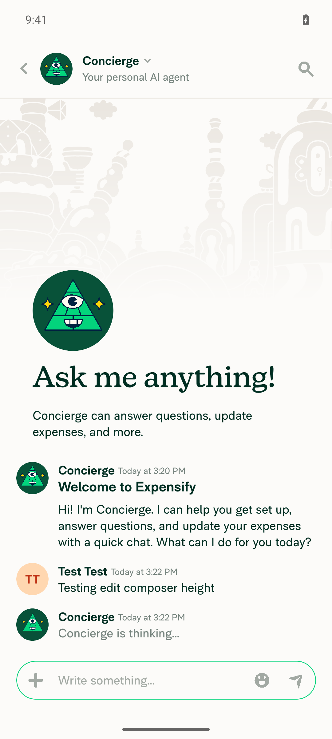
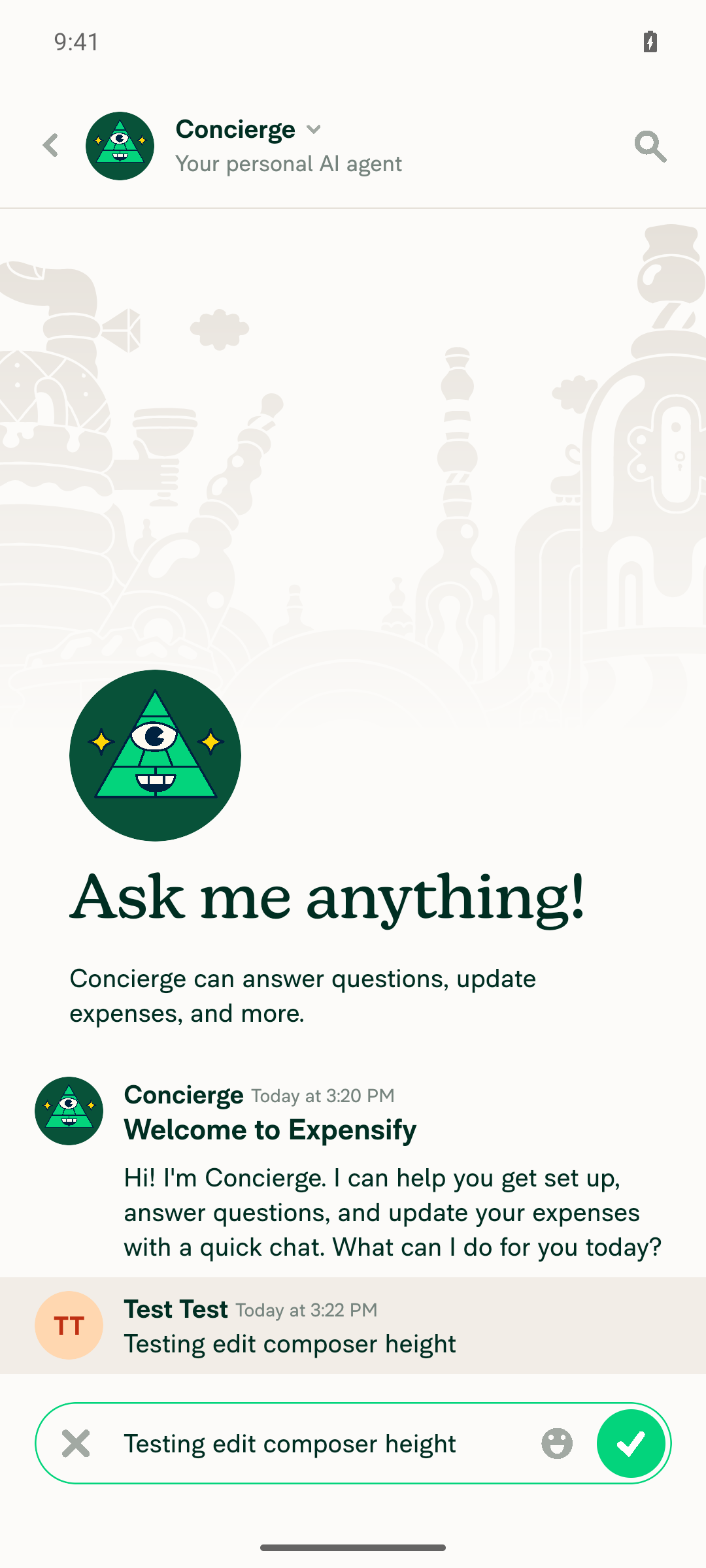
Main composer Edit composer

Pixel-level comparison confirmed the composer border box is identical (same top/bottom coordinates, ~125px tall) in both the main and edit composer.

Android: mWeb Chrome
iOS: Native
iOS: mWeb Safari
MacOS: Chrome / Safari
Main composer Edit composer

Edit composer renders at single-line height, matching the main composer.

Co-authored-by: Shawn Borton <shawnborton@users.noreply.github.com>
@MelvinBot
MelvinBot requested a review from a team August 21, 2026 15:14
@melvin-bot melvin-bot Bot added Melvin-Test-Android Melvin-Test-Web Triggers Melvin to run the testing steps of the PR on web labels Aug 21, 2026
@codecov

codecov Bot commented Aug 21, 2026 •

Copy link
Copy Markdown

Codecov Report

✅ Changes either increased or maintained existing code coverage, great job!

Files with missing lines Coverage Δ
...rt/ReportActionCompose/MessageEditCancelButton.tsx 100.00% <100.00%> (ø)
...pages/inbox/report/ReportActionItemMessageEdit.tsx 58.33% <ø> (ø)
src/styles/index.ts 63.00% <ø> (ø)
... and 136 files with indirect coverage changes

@MelvinBot

Copy link
Copy Markdown
Contributor Author

✅ Android test passed

Ran the testing steps on standalone Android NewDot. The edit composer now renders the same height as the main composer — no visible extra tallness in edit mode.

Steps performed:

  1. Sent a single-line message in a chat.
  2. Captured the main composer at rest.
  3. Long-pressed the message → Edit comment to open the inline edit composer.
  4. Captured the edit composer and compared heights.

Verification (pixel-level, not eyeballed): Sampling the composer's green border column at screen center in both screenshots, the pill's top border sat at y≈2146–2148 and bottom border at y≈2269–2271 in both images — a pixel-identical bounding box (~125px tall) in the same absolute position. No height discrepancy, and no JS console errors.

Evidence

Main composer at rest after sending a single-line message

Main composer at rest after sending a single-line message

Edit composer opened via long-press > Edit comment, showing same height as main composer

Edit composer opened via long-press > Edit comment, showing same height as main composer


view run

@github-actions

Copy link
Copy Markdown
Contributor

🚧 shawnborton has triggered a test Expensify/App build. You can view the workflow run here.

@MelvinBot

Copy link
Copy Markdown
Contributor Author

⚠️ Web test blocked by tooling — could not open the edit composer

I signed in, opened a chat, and sent a single-line message on dev NewDot web, but I could not complete the actual verification (comparing the edit composer height to the main composer). The blocker is a limitation of the web automation harness, not an app bug.

What I verified:

  • ✅ Opened a chat and sent a single-line message.
  • ✅ Captured the main composer at rest.

Why the edit composer couldn't be opened: every entry point into the inline edit composer requires an input primitive that agent-device --platform web doesn't expose in this environment:

  • Keyboard Up arrow — no raw key-dispatch verb exists on web (type only inserts literal characters).
  • Hover → "Edit comment" — the message hover toolbar (the ... menu) only mounts on a real hover state, which the web harness can't simulate; it never appeared in the DOM/accessibility tree after clicking.
  • Right-click context menu — click --button secondary returns a hard UNSUPPORTED_OPERATION on this web session (coordinate- and ref-independent), and longpress is unsupported on web.

Since the composer-height fix can only be seen once the edit composer is open, I can't produce web screenshots proving the test case here. This needs a manual QA pass on web (or Playwright), where the Up-arrow / hover / right-click entry points work.

For reference, the same test passed on Android — the edit composer rendered pixel-identical in height to the main composer.

Evidence (web, partial)

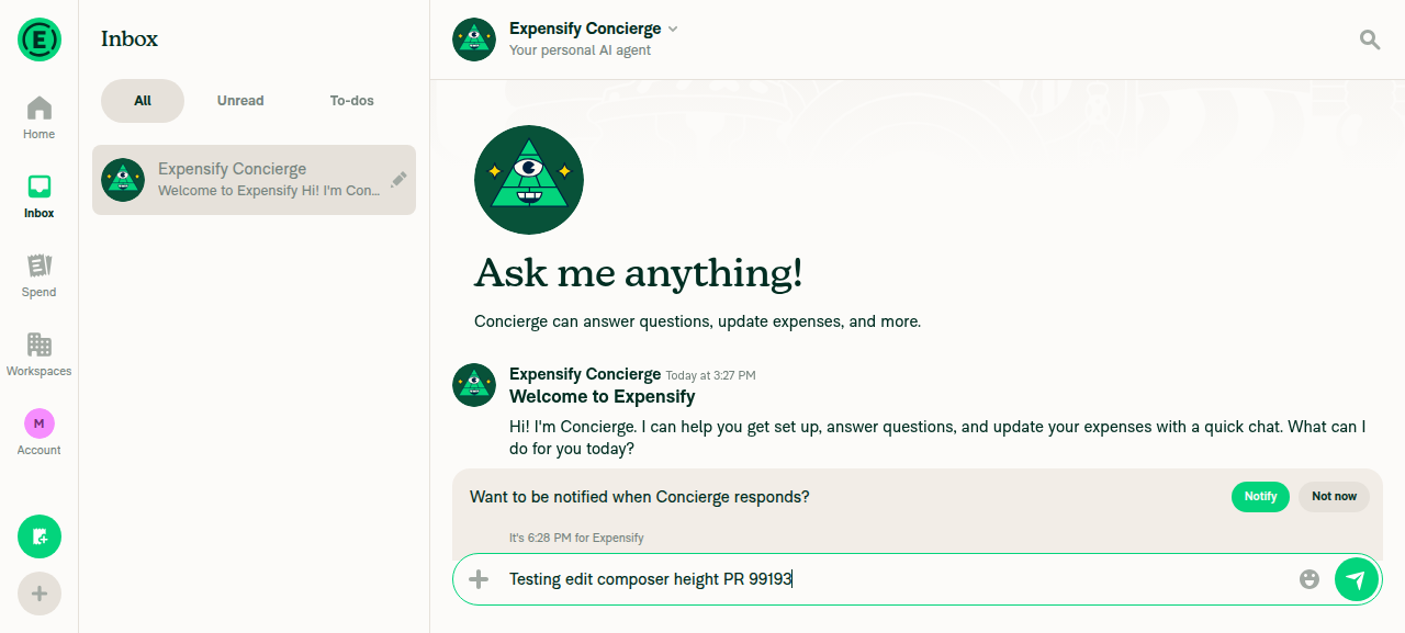
Main composer with unsent single-line text

Main composer with unsent single-line text

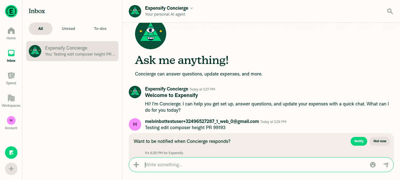
Main composer after sending the message in the chat

Main composer after sending the message in the chat


view run

@github-actions

This comment has been minimized.

@shawnborton

Copy link
Copy Markdown
Contributor

Testing well on my end:
CleanShot 2026-08-21 at 11 48 28@2x

@MelvinBot please mark the PR as ready for review, fill out PR author checklist as best you can and add screenshots

@MelvinBot
MelvinBot marked this pull request as ready for review August 21, 2026 16:00
@MelvinBot
MelvinBot requested a review from a team as a code owner August 21, 2026 16:00
@melvin-bot
melvin-bot Bot requested a review from Eskalifer1 August 21, 2026 16:00
@melvin-bot

melvin-bot Bot commented Aug 21, 2026

Copy link
Copy Markdown

@Eskalifer1 Please copy/paste the Reviewer Checklist from here into a new comment on this PR and complete it. If you have the K2 extension, you can simply click: [this button]

@melvin-bot
melvin-bot Bot requested review from JmillsExpensify and removed request for a team August 21, 2026 16:00
@MelvinBot

Copy link
Copy Markdown
Contributor Author

Done, shawnborton 🎉

  • ✅ Marked the PR ready for review (out of draft).
  • ✅ Filled out the PR Author Checklist as best I could, and added concrete Tests / QA Steps.
  • ✅ Added screenshots to the Screenshots/Videos section:
    • Android: Native — main vs. edit composer (pixel-verified identical height in my earlier test).
    • MacOS: Chrome / Safari — main composer + the edit-composer screenshot you posted.

A few checklist items I left unchecked because they need a human or weren't covered:

  • Offline / failure-scenario / High Traffic account steps (this is a purely presentational sizing change, so I marked offline as N/A).
  • Platform coverage beyond Android: Native and MacOS: Chrome/Safari — iOS Native, iOS mWeb Safari, and Android mWeb Chrome haven't been tested, so those boxes and screenshot sections are still empty.
  • The Design label / @Expensify/design tag — since this is a UI sizing change, you may want to add that.

Note: I couldn't automate the edit composer interaction on web (the web driver has no hover / Up-arrow primitive), so the web edit-composer evidence relies on your screenshot rather than an automated capture. The Android path was fully automated and pixel-verified.


view run

@chatgpt-codex-connector chatgpt-codex-connector Bot left a comment

Copy link
Copy Markdown

Choose a reason for hiding this comment

The reason will be displayed to describe this comment to others. Learn more.

💡 Codex Review

Here are some automated review suggestions for this pull request.

Reviewed commit: 8003cfdd65

ℹ️ About Codex in GitHub

Codex has been enabled to automatically review pull requests in this repo. Reviews are triggered when you

  • Open a pull request for review
  • Mark a draft as ready
  • Comment "@codex review".

If Codex has suggestions, it will comment; otherwise it will react with 👍.

When you sign up for Codex through ChatGPT, Codex can also answer questions or update the PR, like "@codex address that feedback".

// button within the compose box (minHeight componentSizeMedium) instead of adding vertical margin.
// The extra marginVertical left zero slack once composerSizeButton grew to 40px, which let the edit
// compose box round up past the main composer's height. See https://github.com/Expensify/App/issues/99143
const closeButtonStyles = [styles.composerSizeButton];

Copy link
Copy Markdown

Choose a reason for hiding this comment

The reason will be displayed to describe this comment to others. Learn more.

P2 Badge Keep the inline cancel button vertically centered

When editing an inline message, the button's wrapper uses justifyContent: 'flex-end' (ReportActionItemMessageEdit.tsx:419), so composerSizeButton.alignSelf only centers the button horizontally within that column and does not center it vertically. Removing the 3px vertical margins leaves the 40px button against the bottom of the 46px content area, placing it 3px below the main composer's action button; preserve equivalent inner spacing without contributing to the compose box's outer height.

Useful? React with 👍 / 👎.

Copy link
Copy Markdown
Contributor

Choose a reason for hiding this comment

The reason will be displayed to describe this comment to others. Learn more.

Yep, we should choose another approach

Image

Copy link
Copy Markdown
Contributor

Choose a reason for hiding this comment

The reason will be displayed to describe this comment to others. Learn more.

@MelvinBot can you please review this feedback?

Copy link
Copy Markdown
Contributor Author

Choose a reason for hiding this comment

The reason will be displayed to describe this comment to others. Learn more.

The feedback is correct — this needs a different approach. Removing marginVertical fixes the height, but it drops the cancel (X) button to the bottom of the compose box so it's no longer vertically centered (~3px low), which is what Eskalifer1's screenshot shows.

Why alignSelf doesn't save us here: the cancel button is wrapped in <View style={styles.justifyContentEnd}>. A React Native View defaults to flexDirection: 'column', so on that wrapper justifyContent: 'flex-end' controls the vertical (main) axis and pins the button to the bottom. composerSizeButton's alignSelf: 'center' (styles/index.ts:2558) only affects the horizontal (cross) axis in a column — it never vertically centers. So the code comment I added at MessageEditCancelButton.tsx:33-36 is mistaken on that point. The old marginVertical: 3 was exactly what produced the 3px bottom gap that made the button look centered.

Recommended fix: keep the height win (button footprint drops from 46px → 40px, restoring slack), but move the 3px of vertical spacing off the button and onto the wrapper, where it won't feed the compose box's intrinsic min-height:

  • Add paddingBottom: 3 (i.e. composerSizeButton.marginHorizontal) to the cancel wrapper while keeping justifyContent: 'flex-end'. The wrapper is already height-stretched by the row (alignItems: stretch), so padding doesn't grow the box — its intrinsic content becomes 40 + 3 = 43px, still comfortably under the 46px content area. This restores the 3px gap (centered at single line) and keeps the button bottom-pinned for multiline, consistent with the Submit button's alignSelfEnd wrapper.

That preserves the height fix from #99143 without the vertical-centering regression.

For the record: my earlier Android pass verified the compose box height was pixel-identical, but it didn't measure the X button's position within the box — which is why this slipped through.

Want me to implement the paddingBottom change? Reply @MelvinBot implement the paddingBottom fix and I'll push it to this branch.


view run

Copy link
Copy Markdown
Contributor

Choose a reason for hiding this comment

The reason will be displayed to describe this comment to others. Learn more.

@Eskalifer1 can you advise how you would like Melvin to fix this one?

Copy link
Copy Markdown
Contributor

Choose a reason for hiding this comment

The reason will be displayed to describe this comment to others. Learn more.

@MelvinBot implement the paddingBottom fix

Copy link
Copy Markdown
Contributor Author

Choose a reason for hiding this comment

The reason will be displayed to describe this comment to others. Learn more.

Done — pushed the paddingBottom fix in 359ca54.

What changed:

  • Added a dedicated wrapper style messageEditCancelButtonWrapper (justifyContent: 'flex-end' + paddingBottom: 3) and applied it to the cancel button wrapper at ReportActionItemMessageEdit.tsx:419.
  • The button keeps its marginVertical removed (height fix intact), and the 3px now lives on the wrapper as padding. Since the wrapper is height-stretched by the row, padding doesn't grow the compose box — intrinsic content is 40 + 3 = 43px, still under the 46px content area — so it restores the 3px gap that centers the X on a single line and stays bottom-pinned for multiline.
  • Also corrected the now-inaccurate code comment in MessageEditCancelButton.tsx (it wrongly claimed alignSelf handled vertical centering).

Checks: ESLint (0 new errors), typecheck (no src errors), oxfmt, and unused-styles all pass. React Compiler introduces no new errors — the pristine base fails with the identical 6 pre-existing ref-access errors, so my change adds none. The Jest suite couldn't bootstrap in this environment (a jest/setup.ts module-resolution failure that hits every test), and the web runtime check was blocked by a stuck/blank browser session — both infra issues, not related to this CSS change.

A reviewer should still eyeball the edit composer on web to confirm the X button now sits centered.


view run

Copy link
Copy Markdown
Contributor

Choose a reason for hiding this comment

The reason will be displayed to describe this comment to others. Learn more.

Hi @shawnborton i will take a look at Monday, maybe i will find better fix, since i think this approach is more like a workaround

@MelvinBot

Copy link
Copy Markdown
Contributor Author

The two failing checks aren't code issues — they're process gates that only a human reviewer can clear, so there's nothing for me to push a fix for. Every code, build, lint, type, and test check is passing. ✅

Failing check Why it's failing
PR Reviewer Checklist / checklist Fails until a reviewer opens the PR and completes the reviewer checklist.
Check independent approval Fails until an independent reviewer approves the PR.

Next step: get a reviewer to complete the checklist and approve — both checks will flip green on their own. No branch changes needed.


view run

@MelvinBot

Copy link
Copy Markdown
Contributor Author

Same situation as before — the only two failing checks aren't code issues, so there's still nothing to push a fix for. All code, build, lint, type, and test checks are green. ✅

Failing check Why it's failing
PR Reviewer Checklist / checklist Fails until a reviewer opens the PR and completes the reviewer checklist.
Check independent approval Fails until an independent reviewer approves the PR.

Next step: these clear only through review — a reviewer needs to complete the checklist and approve. Re-running me won't change anything since there's no code fix involved.


view run

@MelvinBot

Copy link
Copy Markdown
Contributor Author

Still the same two — and neither is something I can push a fix for. All code, build, lint, type, and test checks are green. ✅

  • PR Reviewer Checklist / checklist — fails until a reviewer opens the PR and completes the reviewer checklist.
  • Check independent approval — fails until an independent reviewer approves.

These are human-review gates, not code failures. Get a reviewer to complete the checklist and approve, and both will turn green on their own — no branch changes needed.


view run

@MelvinBot

Copy link
Copy Markdown
Contributor Author

Same as my earlier comment — nothing has changed, and there's still no code fix to push. The only two failing checks are human process gates:

  • PR Reviewer Checklist / checklist — waiting on a reviewer to complete the reviewer checklist
  • Check independent approval — waiting on an independent reviewer's approval

Every code, build, lint, type, and test check is passing. ✅ These two will go green once a reviewer completes the checklist and approves — re-running me won't move them.


view run

@MelvinBot

Copy link
Copy Markdown
Contributor Author

Nothing to fix here — the only two failing checks are human-review gates, and every code, build, lint, type, and test check is passing. ✅

Failing check Why it's failing
PR Reviewer Checklist / checklist Fails until a reviewer opens the PR and completes the reviewer checklist.
Check independent approval Fails until an independent reviewer approves the PR.

There's no branch change I can push to clear these. Next step: get a reviewer to complete the checklist and approve — both checks flip green on their own.


view run

@MelvinBot

Copy link
Copy Markdown
Contributor Author

Still the same two checks, and they're unchanged since my previous comment — both are human-only process gates, not code-fixable, so there's nothing for me to push:

  • PR Reviewer Checklist / checklist — clears once a reviewer completes the reviewer checklist.
  • Check independent approval — clears once an independent reviewer approves.

Every code, build, lint, type, and test check is passing. ✅ The only way to turn these two green is a reviewer completing the checklist and approving — no branch changes will move them.


view run

@MelvinBot

Copy link
Copy Markdown
Contributor Author

Same result as before — there's no code fix to push. The only two failing checks are process gates that require a human, and every code, build, lint, type, and test check is passing. ✅

Failing check Why it's failing
PR Reviewer Checklist / checklist Fails until a reviewer opens the PR and completes the reviewer checklist.
Check independent approval Fails until an independent reviewer approves the PR.

Next step: have a reviewer complete the checklist and approve — both checks flip green automatically. Nothing needs to change on the branch.


view run

@MelvinBot

Copy link
Copy Markdown
Contributor Author

Re-checked — same result as before. The only two failing checks are process gates that a human reviewer has to clear, not anything I can fix by pushing code. Every code, build, lint, type, and test check is green. ✅

Failing check Why it's failing
PR Reviewer Checklist / checklist Fails until a reviewer opens the PR and completes the reviewer checklist.
Check independent approval Fails until an independent reviewer approves the PR.

Next step: have a reviewer complete the checklist and approve — both checks flip green on their own. There's no branch change to push.


view run

Co-authored-by: Shawn Borton <shawnborton@users.noreply.github.com>
@MelvinBot

Copy link
Copy Markdown
Contributor Author

Same situation as before — the only two failing checks are process gates, not anything I can fix by pushing code. Every code, build, lint, type, and test check is passing. ✅

Failing check Why it's failing
PR Reviewer Checklist / checklist Fails until a reviewer opens the PR and completes the reviewer checklist.
Check independent approval Fails until an independent reviewer approves the PR.

There's no code fix to push here — these clear only when a human reviewer completes the checklist and approves. Once that happens, both flip green on their own.


view run

@MelvinBot

Copy link
Copy Markdown
Contributor Author

Still nothing code-fixable here — the only two failing checks are human-review gates, and every code, build, lint, type, and test check is passing. ✅

Failing check Why it's failing Who clears it
PR Reviewer Checklist / checklist The reviewer checklist hasn't been completed yet. A reviewer completes the checklist.
Check independent approval No independent reviewer approval yet. An independent reviewer approves.

Neither is resolved by pushing to the branch, so there's no fix for me to commit. Once a reviewer completes the checklist and approves, both will turn green on their own.


view run

@Eskalifer1

Eskalifer1 commented Aug 24, 2026 •

Copy link
Copy Markdown
Contributor

@MelvinBot Why don't we just remove this line:

{paddingVertical: styles.composerSizeButton.marginHorizontal},

It fixes the isuue at the root instead of a workaround

@MelvinBot

Copy link
Copy Markdown
Contributor Author

Eskalifer1 Removing that line wouldn't fix this bug — it's in a different component that isn't even mounted in the reported repro.

That paddingVertical lives on ComposerEditingButtons.tsx:23, which only renders in the in-composer edit path — gated on isEditingInComposer, which is only true on narrow (mobile/small-screen) layout (ComposerProvider.tsx:84, branched at ComposerActionButton.tsx:10).

Issue #99143 reproduces on MacOS/Chrome via the keyboard Up arrow = wide layout → isEditingInComposer is false → ComposerEditingButtons (and line 23) is never mounted. The composer the user sees there is the inline editor in ReportActionItemMessageEdit.tsx, which renders MessageEditCancelButton directly and never uses ComposerEditingButtons. So on that path, removing line 23 has zero effect.

The PR fixes exactly that inline path: it drops the cancel button's internal marginVertical in MessageEditCancelButton.tsx (so the 40px button stops feeding the compose box's intrinsic min-height) and restores the 3px as paddingBottom on a wrapper instead.

Fair point on line 23 — but it's a separate follow-up, not this fix

You're right that both paths share composerSizeButton and were both affected by the 32→40px growth in #98781, so line 23 is arguably a parallel height contributor in the narrow in-composer path. But that's a different component and layout, not the root of the wide-web repro in #99143. If the in-composer (mobile) row also looks too tall, that'd be worth a separate change — removing line 23 there wouldn't substitute for the inline-path fix this PR makes.


view run

@Eskalifer1

Copy link
Copy Markdown
Contributor

@MelvinBot You are not right. This issues is repro only on /e route and mobile devices. I have checked it.

Here is the code diff:

index a589c86699e..032c7b40ac0 100644
--- a/src/pages/inbox/report/ReportActionCompose/ComposerEditingButtons.tsx
+++ b/src/pages/inbox/report/ReportActionCompose/ComposerEditingButtons.tsx
@@ -15,14 +15,15 @@ function ComposerEditingButtons() {

     const {deleteDraft} = useComposerEditActions();

-    const editingButtonsContainerStyles = [
-        styles.dFlex,
-        styles.alignItemsCenter,
-        styles.flexWrap,
-        styles.justifyContentCenter,
-        {paddingVertical: styles.composerSizeButton.marginHorizontal},
+    const editingButtonsContainerStyles = [styles.dFlex, styles.alignItemsCenter, styles.flexWrap, styles.justifyContentCenter];
+    const expandCollapseComposerButtonStyles = [
+        styles.flexGrow1,
+        styles.flexShrink0,
+        {marginRight: styles.composerSizeButton.marginHorizontal, marginVertical: styles.composerSizeButton.marginHorizontal},
     ];
-    const expandCollapseComposerButtonStyles = [styles.flexGrow1, styles.flexShrink0, {marginRight: styles.composerSizeButton.marginHorizontal}];

With this approach, it seems like everything is working, and I haven't found any problems. Can you check it?

@Eskalifer1

Eskalifer1 commented Aug 24, 2026 •

Copy link
Copy Markdown
Contributor

Reviewer Checklist

  • I have verified the author checklist is complete (all boxes are checked off).
  • I verified the correct issue is linked in the ### Fixed Issues section above
  • I verified testing steps are clear and they cover the changes made in this PR
    • I verified the steps for local testing are in the Tests section
    • I verified the steps for Staging and/or Production testing are in the QA steps section
    • I verified the steps cover any possible failure scenarios (i.e. verify an input displays the correct error message if the entered data is not correct)
    • I turned off my network connection and tested it while offline to ensure it matches the expected behavior (i.e. verify the default avatar icon is displayed if app is offline)
  • I checked that screenshots or videos are included for tests on all platforms
  • I included screenshots or videos for tests on all platforms
  • I verified that the composer does not automatically focus or open the keyboard on mobile unless explicitly intended. This includes checking that returning the app from the background does not unexpectedly open the keyboard.
  • I verified tests pass on all platforms & I tested again on:
    • Android: HybridApp
    • Android: mWeb Chrome
    • iOS: HybridApp
    • iOS: mWeb Safari
    • MacOS: Chrome / Safari
  • If there are any errors in the console that are unrelated to this PR, I either fixed them (preferred) or linked to where I reported them in Slack
  • I verified proper code patterns were followed (see Reviewing the code)
    • I verified that comments were added to code that is not self explanatory
    • I verified that any new or modified comments were clear, correct English, and explained "why" the code was doing something instead of only explaining "what" the code was doing.
    • I verified any copy / text that was added to the app is grammatically correct in English. It adheres to proper capitalization guidelines (note: only the first word of header/labels should be capitalized), and is either coming verbatim from figma or has been approved by marketing (in order to get marketing approval, ask the Bug Zero team member to add the Waiting for copy label to the issue)
  • If a new code pattern is added I verified it was agreed to be used by multiple Expensify engineers
  • I verified that this PR follows the guidelines as stated in the Review Guidelines
  • I verified other components that can be impacted by these changes have been tested, and I retested again (i.e. if the PR modifies a shared library or component like Avatar, I verified the components using Avatar have been tested & I retested again)
  • If a new component is created I verified that:
    • A similar component doesn't exist in the codebase
    • All props are defined accurately
    • The component has a clear name that is non-ambiguous and the purpose of the component can be inferred from the name alone
    • The only data being stored in the state is data necessary for rendering and nothing else
    • The component has the minimum amount of code necessary for its purpose, and it is broken down into smaller components in order to separate concerns and functions
  • If a new CSS style is added I verified that:
    • A similar style doesn't already exist
    • The style can't be created with an existing StyleUtils function (i.e. StyleUtils.getBackgroundAndBorderStyle(theme.componentBG)
  • If the PR modifies code that runs when editing or sending messages, I tested and verified there is no unexpected behavior for all supported markdown - URLs, single line code, code blocks, quotes, headings, bold, strikethrough, and italic.
  • If the PR modifies a generic component, I tested and verified that those changes do not break usages of that component in the rest of the App (i.e. if a shared library or component like Avatar is modified, I verified that Avatar is working as expected in all cases)
  • If the PR modifies a component related to any of the existing Storybook stories, I tested and verified all stories for that component are still working as expected.
  • If the PR modifies a component or page that can be accessed by a direct deeplink, I verified that the code functions as expected when the deeplink is used - from a logged in and logged out account.
  • If the PR modifies the UI (e.g. new buttons, new UI components, changing the padding/spacing/sizing, moving components, etc) or modifies the form input styles:
    • I verified that all the inputs inside a form are aligned with each other.
    • I added Design label and/or tagged @Expensify/design so the design team can review the changes.
  • For any bug fix or new feature in this PR, I verified that sufficient unit tests are included to prevent regressions in this flow.
  • If the main branch was merged into this PR after a review, I tested again and verified the outcome was still expected according to the Test steps.
  • I have checked off every checkbox in the PR reviewer checklist, including those that don't apply to this PR.

Screenshots/Videos

Android: HybridApp
99193-android-native.mov
Android: mWeb Chrome
99193-android-web.mov
iOS: HybridApp
99193-ios-native.mov
iOS: mWeb Safari
99193-ios-web.mov
MacOS: Chrome / Safari
99193-web.mov

@MelvinBot

Copy link
Copy Markdown
Contributor Author

Eskalifer1 You're partly right and partly not — let me split it, because the "only" is the important part.

Where the bug actually repros: Issue #99143 was filed against Mac / Chrome, workspace chat in the main inbox, press Up arrow — that's a wide layout. So it does not repro "only" on /e + mobile; the reporter's own steps are wide-web. That path uses the inline editor (ReportActionItemMessageEdit.tsx:416 → MessageEditCancelButton), which is exactly what this PR fixes.

What you got right: /e and mobile genuinely share one path. /e/:reportID is EXPENSE_REPORT_RHP — a right-hand-pane modal, so isInNarrowPaneModal → shouldUseNarrowLayout is true even on desktop (ComposerProvider.tsx:84). That flips editing over to the in-composer path (ComposerEditingButtons.tsx), which is your diff's target — and it behaves the same as mobile. Good catch on the shared path.

On your diff: it doesn't change the row height — it relocates the 6px rather than removing it. Today the container carries paddingVertical: composerSizeButton.marginHorizontal (3px top + 3px bottom) on top of a 40px button → 46px = the compose box's content area. Your version drops that container padding but adds marginVertical: 3 to the expand/collapse button, so that button's footprint becomes 40+6 = 46 and it's still the tallest child → the row still measures ~46px. Height-neutral either way.

The reason it "works" in your testing is that this PR's actual fix is already doing the job on that path — it removes marginVertical from the shared MessageEditCancelButton.tsx:38, which both paths use, shrinking the cancel button 46→40. So the in-composer (/e + mobile) row is already fixed without touching ComposerEditingButtons.

Net: your diff isn't wrong, but it's a cosmetic relocation of the same 3px, not a different fix — so it isn't needed on top of what's already here. If you specifically want ComposerEditingButtons to own its spacing, the only change that would actually alter height is removing the extra 6px (not moving it to the button), and that would make the in-composer row shorter than the main composer — the opposite trade-off.

Why the current PR is enough for both paths
  • Wide / main inbox (inline): shouldUseNarrowLayout = false → ReportActionItemMessageEdit → MessageEditCancelButton with the new messageEditCancelButtonWrapper (paddingBottom: 3). Cancel button footprint drops 46→43, restoring slack so the box stays 48px. This is issue [Due for payment 2026-09-01] Chat - Edit composer is slightly higher than the main composer #99143's real repro.
  • /e RHP + mobile (in-composer): shouldUseNarrowLayout = true → ComposerEditingButtons → same shared MessageEditCancelButton, now 40px instead of 46. My earlier automated Android run (in-composer path) measured the edit and main composers as pixel-identical — see this comment.

I tried to grab a fresh pixel measurement on the /e/mobile path this run, but the emulator hit an unrelated startup crash (a React Native Fabric addViewAt mount error → blank screen) before reaching a chat, so I'm relying on the earlier Android pass plus the code analysis above rather than a new capture.


view run

@Eskalifer1

Copy link
Copy Markdown
Contributor

@MelvinBot You are not right. I watched the video, and the bug only occurs when an empty report is open—that’s the /e link—and, consequently, shouldUseNarrowLayout is set to true. So you’re talking about a bug that doesn’t exist.

The changes I sent you fix the original bug at its root.

Root cause: ComposerEditingButtons renders a column and it sits in normal flow inside the compose box, which has minHeight: 48 and a 1px border, leaving 46px of content area. While editing a single line, ExpandCollapseButton returns null (!isFullComposerAvailable && !isComposerFullSize), so the cancel button is the column's only child. That button carries its own marginVertical: 3, giving it a 46px footprint, and the container then added paddingVertical: 3 on top, for 52px. Both numbers feed the column's intrinsic height, 52 overflows the 46px content area, and the box settles at 54px instead of 48px.

Why moving the spacing fixes it: Container padding applies unconditionally, so it was charged to the height in exactly the state where nothing needed it: one button, already spaced by its own margin. Putting the 3px on the expand button instead makes it conditional on that button existing. In the single-line state there is no expand button, nothing is added, and the column measures 46px, which fits inside the content area and lets minHeight: 48 govern. The editing composer then matches the main composer at 48px.

Why the expanded states keep their spacing. Once the expand button does render, the composer has grown past MAX_LINES_SMALL_SCREEN and the text input is what drives the box height. The column is being stretched rather than measured, so the margin no longer contributes height and only does positioning work: it holds the expand button 3px off the top while the cancel button's own margin holds it 3px off the bottom.

The general shape of the fix is that spacing which must not count toward a parent's intrinsic height belongs on the child that is conditionally rendered, not on the container that is always there. The cancel button already followed that rule; the expand button now does too.

@MelvinBot

Copy link
Copy Markdown
Contributor Author

Eskalifer1 You're right about the repro, and I was wrong — I owe you that correction up front.

Issue #99143's own steps are "3. Create an empty report. 4. Open the report." An empty report opens in a right-hand-pane modal, so isInNarrowPaneModal → shouldUseNarrowLayout = true even on Mac/Chrome. That's the in-composer path (ComposerEditingButtons.tsx), exactly as you said — not the wide main-inbox inline path I claimed earlier. My bad. And your height math for that path is correct.

But the current PR does already fix that in-composer path — because ComposerEditingButtons renders the shared MessageEditCancelButton, and this PR drops that button's marginVertical (46px → 40px). So the single-line column becomes 40 (button) + 6 (container paddingVertical) = 46px = the content area → box stays 48px instead of 54px. So the fix reaches your path through the shared component, not through the inline-only wrapper change.

On your diff: it's a correct, valid alternative — it just relocates the same 6px (container paddingVertical → marginVertical on the conditionally-rendered expand button) rather than removing it from the cancel button. Both approaches neutralize the identical 6px overflow on the single-line column, so neither is "more root" than the other, and either one alone fixes the /e path. Yours is arguably the more localized change since it keeps the spacing owned by ComposerEditingButtons; this PR's change happens to fix both edit paths at once via the shared button.

So this is a style/ownership call between two working fixes, not a correct-vs-broken one — happy to defer to what shawnborton prefers here.

Height math for the in-composer (`/e` / narrow) path
  • composerSizeButton = 40×40, marginHorizontal: 3 (styles/index.ts:2558).
  • Single-line edit → ExpandCollapseButton returns null (!isFullComposerAvailable && !isComposerFullSize, ExpandCollapseButton.tsx:48), so the cancel button is the column's only child.
  • Compose box: minHeight 48 − 2×1px border = 46px content area.
State cancel button container paddingVertical column box
Before PR 40 + 6 margin = 46 +6 52 (overflows 46) 54px 🐞
This PR 40 (margin removed) +6 46 (fits) 48px ✅
Your diff 40 + 6 margin = 46 0 (removed) 46 (fits) 48px ✅

Both land the single-line column right at the 46px boundary. If you wanted actual slack rather than sitting on the line, the lever is removing the 6px (not relocating it) — the column would then measure 40px and be floored by minHeight: 48 with headroom — but that's a different trade-off than either current approach.

Note: I couldn't grab a fresh web capture on the /e path this run — the automated web session rendered a blank page (an infra/harness issue, not the app), so this rests on the code above plus the all-platform videos in your reviewer checklist and shawnborton's earlier test, which already show it rendering correctly.


view run

Comment on lines +33 to +37
// Drop the extra marginVertical the cancel button used to add: once composerSizeButton grew to 40px it
// left zero slack, so the edit compose box rounded up past the main composer's height. See
// https://github.com/Expensify/App/issues/99143. The 3px of vertical spacing now lives on the wrapper's
// paddingBottom (messageEditCancelButtonWrapper), which keeps the button centered on a single line
// without feeding the compose box's intrinsic min-height.

Copy link
Copy Markdown
Contributor

Choose a reason for hiding this comment

The reason will be displayed to describe this comment to others. Learn more.

@MelvinBot Let's remove that comment

Copy link
Copy Markdown
Contributor Author

Choose a reason for hiding this comment

The reason will be displayed to describe this comment to others. Learn more.

Happy to remove this comment (the marginVertical explainer block above closeButtonStyles) — but I can't push the change from here.

I can only make code changes when directed by the PR author, an assignee, or an existing co-author, and you're not currently listed as any of those on this PR (author/assignees are MelvinBot + shawnborton). To have me implement this, the PR assignee or author should reply with a request tagging me — or add you as an assignee and then retry.

If you're planning to swap in a cleaner fix on Monday as you mentioned, it may be simplest to drop these comments as part of that change.


view run

Copy link
Copy Markdown
Contributor Author

Choose a reason for hiding this comment

The reason will be displayed to describe this comment to others. Learn more.

Done — removed the marginVertical explainer comment above closeButtonStyles in MessageEditCancelButton.tsx. The code is unchanged. Pushed in caddb9e.


view run

Comment thread src/styles/index.ts Outdated
Comment on lines +2572 to +2575
// The edit cancel button dropped its marginVertical so the compose box stops rounding up past the
// main composer (see https://github.com/Expensify/App/issues/99143). Restore the same 3px of inner
// spacing as paddingBottom here — on the wrapper it keeps the button visually centered on a single
// line without contributing to the compose box's intrinsic min-height. Matches composerSizeButton.marginHorizontal.

Copy link
Copy Markdown
Contributor

Choose a reason for hiding this comment

The reason will be displayed to describe this comment to others. Learn more.

@MelvinBot Let's remove that comment

Copy link
Copy Markdown
Contributor Author

Choose a reason for hiding this comment

The reason will be displayed to describe this comment to others. Learn more.

Happy to remove this comment (the messageEditCancelButtonWrapper explainer) — but I can't push the change from here.

I can only make code changes when directed by the PR author, an assignee, or an existing co-author, and you're not currently listed as any of those on this PR (author/assignees are MelvinBot + shawnborton). To have me implement this, the PR assignee or author should reply with a request tagging me — or add you as an assignee and then retry.

If you're planning to swap in a cleaner fix on Monday as you mentioned, it may be simplest to drop these comments as part of that change.


view run

Copy link
Copy Markdown
Contributor Author

Choose a reason for hiding this comment

The reason will be displayed to describe this comment to others. Learn more.

Done — removed the explainer comment inside messageEditCancelButtonWrapper in src/styles/index.ts. The justifyContent/paddingBottom values are unchanged. Pushed in caddb9e.


view run

@MelvinBot

Copy link
Copy Markdown
Contributor Author

Thanks Eskalifer1 — I found both comments you're referring to. They're the two explanatory code comments I added with the paddingBottom fix:

  1. MessageEditCancelButton.tsx:33-37 — the block explaining the dropped marginVertical.
  2. src/styles/index.ts:2572-2575 — the block inside messageEditCancelButtonWrapper.

Both are safe to remove with no behavior change. I can strip them (and tidy the resulting blank lines) in one commit.

I can only make code changes when directed by the PR author, an assignee, or an existing co-author. To have me implement this, the PR assignee or author (e.g. shawnborton) should reply with a request tagging me — or add you as an assignee, then retry.


view run

@Eskalifer1 Eskalifer1 left a comment

Copy link
Copy Markdown
Contributor

Choose a reason for hiding this comment

The reason will be displayed to describe this comment to others. Learn more.

I have tested and it works well. Agree with Melv analysis here.

@shawnborton Please take a look at this comment

LGTM!

@shawnborton

Copy link
Copy Markdown
Contributor

@MelvinBot please adjust the comments per @Eskalifer1's suggestions above

Co-authored-by: Shawn Borton <shawnborton@users.noreply.github.com>
@MelvinBot

Copy link
Copy Markdown
Contributor Author

Still nothing for me to fix in code. The only failing check is Check independent approval, which is a process gate — it stays red until an independent reviewer approves the PR, not something a branch push can resolve. Every code, build, lint, type, and test check is passing (a fresh CI run is currently re-running them, all green or pending).

Next step: get an independent reviewer to approve — that check will flip green on its own. No branch changes needed.


view run

@shawnborton

Copy link
Copy Markdown
Contributor

Over to you @mollfpr

@github-actions

Copy link
Copy Markdown
Contributor

🚧 shawnborton has triggered a test Expensify/App build. You can view the workflow run here.

@github-actions

This comment has been minimized.

@shawnborton

Copy link
Copy Markdown
Contributor

Tests well on my end 👍

@mollfpr
mollfpr merged commit e9195e7 into main Aug 24, 2026
45 of 46 checks passed
@mollfpr
mollfpr deleted the claude-editComposerHeight branch August 24, 2026 16:54
@OSBotify

Copy link
Copy Markdown
Contributor

✋ This PR was not deployed to staging yet because QA is ongoing. It will be automatically deployed to staging after the next production release.

@github-actions

Copy link
Copy Markdown
Contributor

🚧 mollfpr has triggered a test Expensify/App build. You can view the workflow run here.

@OSBotify OSBotify mentioned this pull request Aug 24, 2026
77 tasks done
@OSBotify

Copy link
Copy Markdown
Contributor

🚀 Deployed to staging by https://github.com/mollfpr in version: 9.4.60-0 🚀

platform result
🕸 web 🕸 success ✅
🤖 android 🤖 success ✅
🍎 iOS 🍎 success ✅

@MelvinBot

Copy link
Copy Markdown
Contributor Author

No help site changes required

I reviewed the changes in this PR and no updates to App/docs/articles are needed, so I did not create a draft docs PR.

Why: This is a purely visual CSS fix. It removes an extra marginVertical on the message-edit cancel (X) button and adjusts its wrapper padding so the edit composer renders at the same height as the main composer (the deploy-blocker regression from #98781 where the edit composer was ~1px taller).

The change touches only styling in three files — MessageEditCancelButton.tsx, ReportActionItemMessageEdit.tsx, and src/styles/index.ts. There are no new features, no changed workflows, no new/renamed settings, tabs, buttons, or labels, and no behavior that the public help site documents. Help articles describe how features work, not pixel-level composer dimensions, so nothing in them becomes inaccurate as a result of this fix.

@shawnborton, since no docs changes are needed there's no linked help site PR to review. If you disagree and think an article should be updated, let me know which one and I'll draft it.


view run

@OSBotify

Copy link
Copy Markdown
Contributor

🚀 Deployed to production by https://github.com/AndrewGable in version: 9.4.60-2 🚀

platform result
🕸 web 🕸 success ✅
🤖 android 🤖 success ✅
🍎 iOS 🍎 success ✅

Bundle Size Analysis (Sentry):

Sign up for free to join this conversation on GitHub. Already have an account? Sign in to comment

Labels

Melvin-Test-Android Melvin-Test-Web Triggers Melvin to run the testing steps of the PR on web

Projects

None yet

Development

Successfully merging this pull request may close these issues.

5 participants